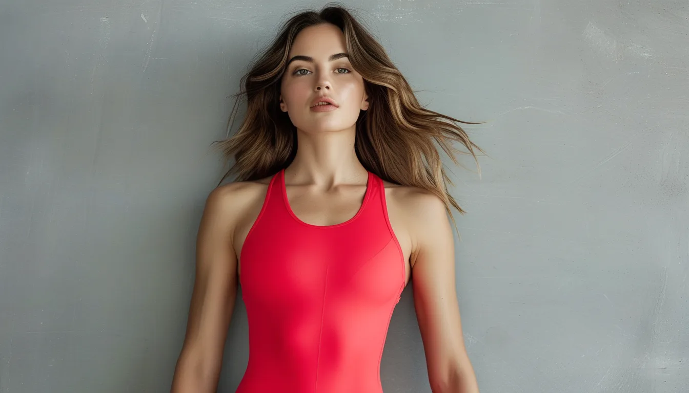
Why Two Red Pieces in the Same Outfit Rarely Match
Quick Answer: Reds clash more than other colors because red pigments sit near the edge of human color discrimination, so small undertone differences — a slightly blue-based red next to a slightly yellow-based one — read as clearly wrong even when both look identical indoors. Match reds in daylight, or deliberately separate them with a neutral so they never sit edge to edge.
You picked the red top and the red sneakers because they were both, obviously, red. Then you stepped outside and one of them turned distinctly orange.
This is not a bad eye. Red genuinely is harder to match than any other color in your wardrobe, and the reasons are about pigments and lighting rather than taste.
Here is why it happens and the two reliable ways around it.
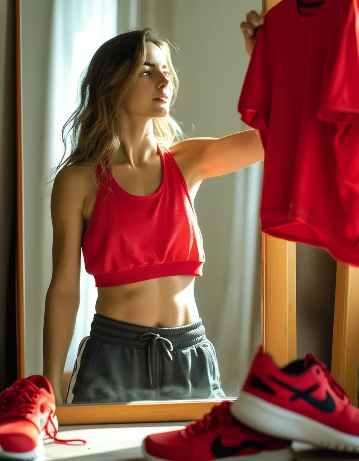
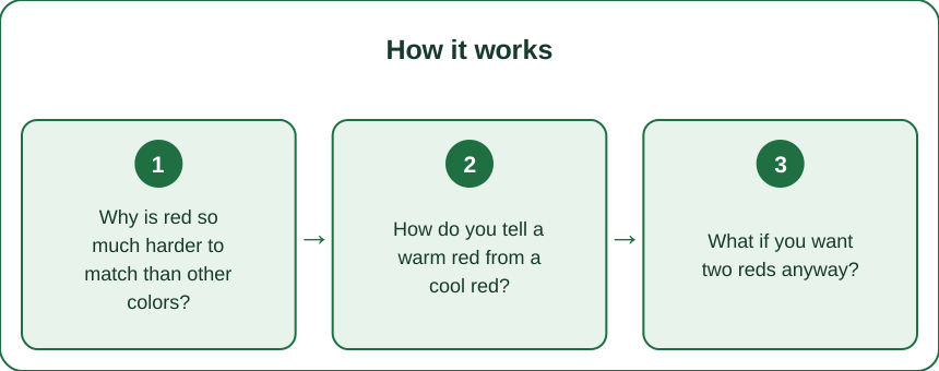
Why is red so much harder to match than other colors?
Because a huge range of pigments all read as red, and small differences between them are extremely visible when they touch.
Red is a wide neighborhood. Blue-based reds (crimson, cherry, ruby) and yellow-based reds (tomato, scarlet, brick) both register as red in your memory but sit noticeably apart when compared side by side. Blue does not fragment this way nearly as much.
Your eye is unusually sensitive here. Human vision has the finest discrimination in the red-to-yellow range, an evolutionary hangover from picking ripe fruit. You will catch a red mismatch you would never notice between two greens.
Dyes fade in different directions. Red is the least colorfast common dye family. A cherry red washed 30 times drifts toward a dusty rose; a scarlet drifts toward orange. Two matching pieces bought together can genuinely diverge in one season.
Fabric changes the reading. The same dye looks deeper on matte cotton, brighter on nylon, and lighter on a textured knit. Two pieces with an identical dye lot can still visibly disagree because of sheen.
How do you tell a warm red from a cool red?
Put them on white, in daylight. The comparison is instant once the reference is fixed.
Use a sheet of white paper. Lay both pieces on it near a window. Against a genuine white, warm reds show their orange lean and cool reds show their pink or blue lean immediately.
Daylight is non-negotiable. Warm indoor bulbs push everything toward orange and will make a cool red look neutral. Store lighting is often specifically flattering to red, which is why so many mismatches are bought in good faith.
Look at the shadow, not the highlight. The folded, shaded part of the fabric shows undertone most honestly. Highlights blow out toward white and hide the lean.
Then sort your closet once. Two piles: warm reds and cool reds. Ten minutes of sorting saves you every future guess — and most people find their existing reds are heavily weighted to one side.
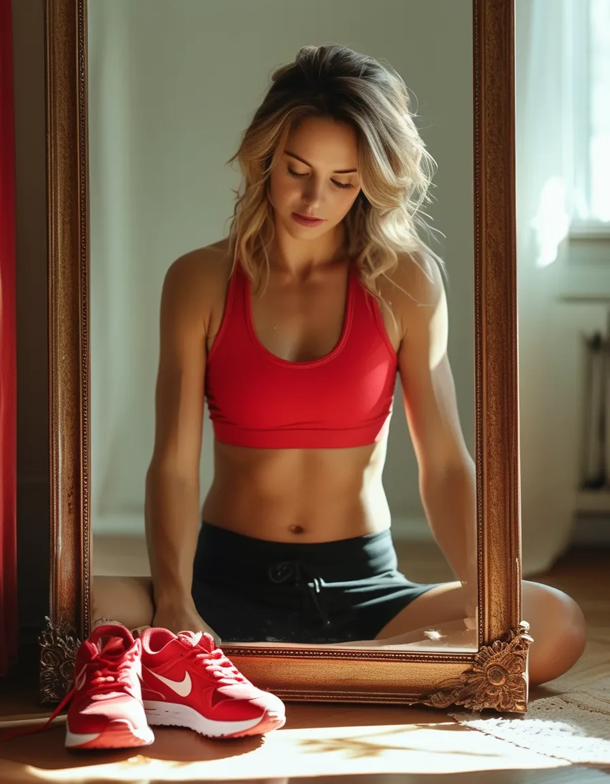
What if you want two reds anyway?
Then stop trying to match and start managing distance. Both routes work.
Separate them with a neutral. Red top and red shoes look intentional when there is black, white, cream, or denim between them. The eye stops making a direct comparison once they are not adjacent.
Or make the difference obvious. Two reds that are clearly different in depth — a deep burgundy with a bright cherry — read as a deliberate tonal choice. The problem is only ever near-matches, which read as a failed attempt.
Keep the exact match to one pairing. If you want true matching red, do it with two pieces bought together in the same fabric, and accept it will drift after a season of washing.
Use texture to your advantage. A ribbed red and a smooth red at the same depth read as tonal layering rather than a mismatch, because the eye attributes the difference to the surface.
5 Mistakes Everyone Makes With Two Reds
1. Matching under store lighting. Retail lighting is warm and generous to red. Take both pieces to a window or a doorway before deciding — the answer changes constantly.
2. Assuming the same brand means the same red. Dye lots vary between production runs and between fabric types. A brand’s red legging and red bra can easily be different reds.
3. Washing reds with everything else. Red bleeds and fades faster than nearly anything. Cold water, inside out, and separate from lights keeps a matched pair matched much longer.
4. Pairing red with red across a hard edge. A red waistband directly against a red hem is the single most exposed position for a near-match. Let a neutral, a layer, or a gap sit between them.
5. Forgetting that your third red is red too. People plan the top and the shoes and then add a red hair tie, red water bottle, or red bag. A third red almost always breaks a pairing that was working.
FAQ: Wearing Red Questions, Answered
Which red is safest to build around?
A true mid-red that leans very slightly warm. It plays well with denim, black, cream, camel, and olive, and it is the most forgiving next to other reds. Very cool crimsons and very orange scarlets are both harder to pair.
Can I wear warm red and cool red together on purpose?
Yes, if you push the depth apart and add a neutral between them. Burgundy and bright coral-red with cream in between works. Two mid-depth reds with different undertones touching does not.
How do I stop my reds from fading in different directions?
Cold water, inside out, no dryer, and wash reds together rather than with lights. Sun exposure is the other big factor — drying red on a bright balcony fades it noticeably faster than drying it indoors.
TL;DR:
- Red covers a very wide pigment range and your eye is unusually good at spotting small differences in it.
- Sort your reds into warm and cool piles once, on white paper, in daylight.
- Near-matches look like mistakes; either separate reds with a neutral or make the depth difference obvious.
- Fabric sheen and dye fade both shift red over time, so matched pieces drift apart within a season.
- Watch for the accidental third red — a bottle, bag, or hair tie will break a working pair.
Red is the most rewarding color to wear and the least forgiving to match. Once you stop trying to make two reds identical and start controlling how close they sit, wearing several at once gets much easier.
Keep Reading
This article is for general informational and styling purposes only. Fit, sizing, and product availability may vary.