Why the Same Red Accessory Reads Completely Differently in Autumn Light
Quick Answer: Autumn daylight is warmer in colour temperature and arrives at a lower angle, which shifts warm-based reds toward orange and makes cool blue-based reds look richer and more saturated. If your red suddenly reads as wrong, the usual cause is that it is a warm red now sitting against a warm-lit environment with nothing to contrast against. The fix is either to switch to a cooler red or to give the warm one something cool - navy, grey, cool denim - to sit against.
The bag that looked crisp in July looks slightly muddy in September. Same bag, same outfit, different month.
Colour is relational, and autumn changed both terms of the relationship.
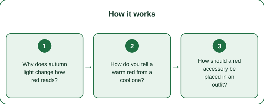
Why does autumn light change how red reads?
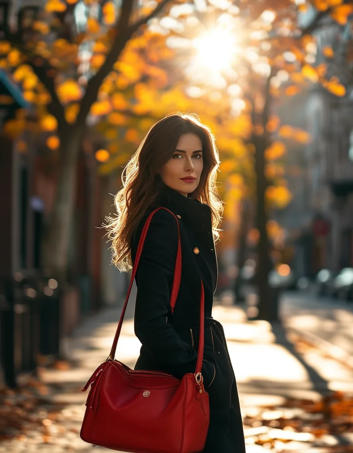
The sun sits lower, so light passes through more atmosphere, which scatters shorter wavelengths and leaves warmer light. This is the same mechanism that makes sunsets orange, operating mildly all day in autumn.
Warmer ambient light adds orange to everything it falls on, which pushes an already warm red - a tomato, a coral red, a scarlet - further toward orange.
Cool blue-based reds gain from the same effect. Warm light partially neutralises their blue, which reads as richer and more saturated rather than distorted.
The surrounding environment changes too. Green foliage turning yellow and brown means your red now sits against warm surroundings instead of cool green ones, and simultaneous contrast does the rest.
Overcast autumn days do the opposite, producing cooler, more diffuse light that flattens warm reds and can make them look dusty.
And low-angle light creates stronger directional shading, so a textured red - suede, grain leather, ribbed knit - shows far more tonal variation than it did under overhead summer sun.
How do you tell a warm red from a cool one?
Compare it against a true blue. A cool red sits comfortably next to navy or cobalt; a warm red starts to look orange beside them.
Compare against orange. A warm red harmonises and slightly disappears; a cool red stands clearly apart.
Look at it in shade rather than sun, which removes the warm cast and reveals the underlying pigment.
Warm reds include tomato, coral red, brick, scarlet and vermilion. Cool reds include cherry, crimson, raspberry, burgundy and true fire-engine red.
Photograph it next to a white sheet of paper if you cannot tell - the white gives your eye a reference and the undertone becomes obvious.
And check it in the light you will actually wear it in, because shop lighting is warm and deliberately flattering to warm tones.
How should a red accessory be placed in an outfit?
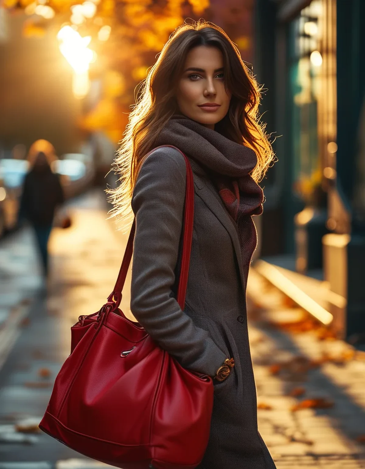
Give a warm red something cool to sit against. Navy, charcoal, cool grey and indigo denim all restore the contrast that warm autumn light removes.
Cool reds work beautifully against autumn’s warm neutrals - camel, cream, tan, olive - because the temperature contrast does the work.
One red accent reads as deliberate; two reads as a theme; three reads as a costume. Two is usually the ceiling, and they should be far apart on the body.
Distance matters more than quantity. A red bag and red shoes work because there is a whole outfit between them. A red bag and a red belt compete because they are adjacent.
Repeat the red at the extremities rather than at the centre if you want the eye to move around the outfit rather than settle.
Consider what is behind you for anything photographed - red against autumn foliage is a warm-on-warm situation that flattens everything.
And matte versus glossy changes the read substantially. A patent red reflects the ambient colour cast and shifts more with the light; a matte suede red stays closer to its own pigment.
What Nobody Tells You About Wearing Red
Red is the colour that most reveals fabric quality. Cheap dye in red goes patchy, fades unevenly and often reads slightly pink at the edges. It is the least forgiving colour to buy at low quality, which is exactly why a good red accessory is worth more than a good red garment.
Red photographs badly on most phone cameras, which clip the red channel and lose all the detail in shadowed areas. If it matters, shoot in softer light or slightly underexpose.
Red fades fastest in sunlight of any common dye colour. A red bag left on a car parcel shelf for a summer is a different bag by September.
Lipstick and accessory reds fight each other when they are different temperatures, and this is the most common unintentional clash people wear. Match the temperature or separate them by distance.
Red near the face is a different decision from red at the hand or foot. Undertone matching matters at the collar and almost not at all at a bag.
Burgundy is not a red for these purposes - it behaves like a neutral in autumn and combines with almost everything, which is why it is the safest entry point.
And a red accessory outperforms a red garment for versatility by a wide margin, because it can be removed from the outfit at any point and it never has to match your skin.
How do you build around a red accent this season?
Start with the neutral base you already wear most - navy, grey, camel or black - and add the red to it rather than building an outfit around the red.
Pick a red temperature that suits your existing wardrobe, not one that suits an imagined one. If your neutrals are warm, a cool red gives you contrast; if they are cool, a warm red does.
One good accessory beats three mediocre ones, particularly in a colour where quality shows.
Test it in daylight before committing, and specifically in the shade rather than in sun.
Keep it away from the same body zone as any other strong colour.
Store it out of direct light to keep the colour from shifting over a season.
And if a red you own has started reading wrong, try it against navy before replacing it. Nine times out of ten the accessory is fine and the outfit around it went warm.
FAQ: Red Accessory Questions, Answered
Why does my red bag look orange in autumn?
Because autumn daylight is warmer in colour temperature, and it adds orange to an already warm-based red. Pairing it with navy or cool grey restores the contrast.
What is the most versatile red to own?
A mid-tone cool red, or burgundy if you want something that behaves like a neutral. Both work against warm and cool neutrals in a way warm reds do not.
Can I wear two red pieces at once?
Yes, if they are the same temperature and far apart on the body - a bag and shoes, not a bag and belt. Adjacent reds compete.
Does red suit everyone?
Some shade of red suits nearly everyone; the temperature is what varies. Undertone matching only really matters near the face, which is why accessories are the low-risk way in.
Why does red fade so fast?
Red dyes are among the least lightfast in common use. Keep red items out of prolonged direct sunlight and store bags in dust covers rather than on a sunny shelf.
How do I photograph red accurately?
Shoot in soft indirect light, slightly underexpose, and avoid warm-on-warm backgrounds like autumn foliage. Phone cameras clip the red channel and lose shadow detail easily.
TL;DR:
- Autumn light is warmer and lower-angle, which pushes warm reds toward orange and makes cool reds look richer.
- The environment changed too - green foliage went warm, so your red lost its contrast.
- Give a warm red something cool to sit against: navy, charcoal, indigo denim.
- Judge undertone in shade, not in sun or shop light, and compare against a true blue.
- Two red accents maximum, and keep them far apart on the body.
- Red shows dye quality more than any other colour, which is why a good red accessory outvalues a red garment.
If a red suddenly reads wrong, try it against navy before replacing it.
Keep Reading
This article is for general informational and styling purposes only. Fit, sizing, and product availability may vary.