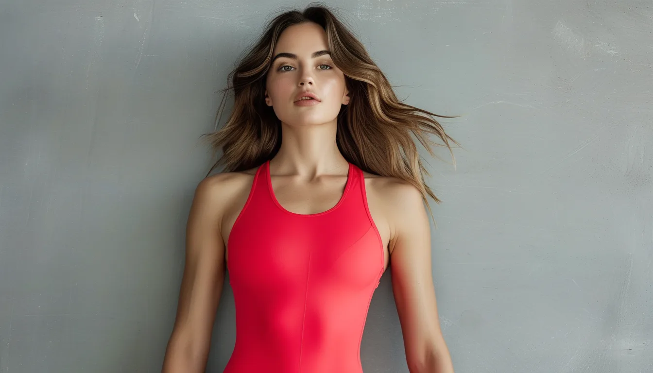
Why Red Shows Sweat Marks Differently Than Other Colors
Quick Answer: Wet fabric goes darker, and how visible that is depends on how far the wet shade sits from the dry shade. Red darkens toward a deep burgundy — a big visual jump — so sweat marks read strongly. Black barely changes, and mid-tone heather grey shows the most of all because its light flecks vanish when wet.
You love the red top. It photographs beautifully, it makes you look like you know what you are doing, and twenty minutes into anything warm it develops a map of your afternoon down the center of your back.
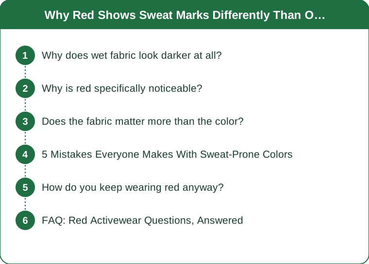
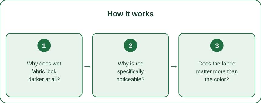
Why does wet fabric look darker at all?
Because water changes how light behaves at the fiber surface.
Dry fabric scatters light in every direction off millions of tiny fiber surfaces, and a lot of that scattered light comes straight back to your eye — which reads as lightness. When water fills the gaps between fibers, it reduces the refractive index difference at those surfaces, so less light scatters back out and more penetrates deeper into the fabric where it gets absorbed.
Less light returning to your eye equals a darker appearance. The dye has not changed at all; the optics have.
How much darker depends on the color’s starting point. A color that is already near-black has little room to darken — black cotton wet looks essentially like black cotton dry. A mid-tone color has a lot of room to move, and red sits squarely in that range.
Why is red specifically noticeable?
Two reasons that compound.
First, the shift is large. A bright red wets down to a deep burgundy or oxblood, which is a substantially different color, not just a darker version of the same one. Your eye reads a color change as well as a brightness change, and color changes attract more attention.
Second, red already draws the eye. It is the color you wore because it stands out. Anything that happens on a red garment is more visible than the same thing on a navy one, simply because people are already looking there.
The rest of the palette, roughly ranked from most to least sweat-visible:
- Heather grey — worst by a distance. The light flecks that make it heather are exactly what disappears when wet, so the contrast is dramatic.
- Light solids — pale blue, blush, sand. Big proportional darkening.
- Mid-tone red, teal, olive. Noticeable, but the shift reads as richer rather than blotchy.
- Navy, charcoal, black. Minimal visible change.
- Busy prints and color-blocked panels. The pattern breaks up the wet edges, which is why they hide it best of all.
Does the fabric matter more than the color?
Often, yes — and this is where it gets useful, because you can choose fabric without giving up the color you like.
What actually determines whether a wet patch forms is how fast moisture spreads and evaporates, not what color the fabric is:
- Cotton absorbs a great deal of moisture and holds it near where it landed, producing a defined, dark, slow-drying patch. This is the classic sweat-mark look.
- Polyester and nylon absorb very little into the fiber itself; moisture travels along the surface, spreads over a wider area, and evaporates faster. The mark is lighter, larger, and shorter-lived.
- Textured knits, ribs, and jacquards break up the visual boundary of a wet area, which matters as much as the drying speed.
- Fabric weight matters too — a thicker knit needs more moisture before saturation shows through.
So a red polyester rib top and a red cotton jersey tee behave completely differently in the same conditions. If you have written off red, it may have been the cotton talking.

5 Mistakes Everyone Makes With Sweat-Prone Colors
-
Assuming darker is always safer. True for black, less true than expected for saturated jewel tones, which can develop a visible sheen where wet even when the darkening is minimal.
-
Buying the heather grey version. It is the softest-looking option on the rack and the single worst performer in warm weather. Almost everyone learns this the hard way once.
-
Ignoring the underarm seam. Sweat marks concentrate where fabric sits closest to skin. A relaxed cut with an open underarm shows dramatically less than a fitted one in the identical fabric and color.
-
Sizing down for a fitted look. Contact means transfer. A garment that skims rather than clings gives moisture somewhere to evaporate before it reaches saturation — this is the one that surprises people who assumed compression was the technical choice.
-
Not washing out the salt. Residual salt and antiperspirant build-up in the underarm area makes fabric hold moisture more readily and stiffen, so an older top shows marks worse than the same top did new. A periodic soak in cool water with a splash of white vinegar reverses most of it.
How do you keep wearing red anyway?
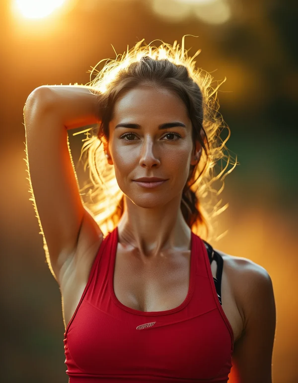
You should. It is a genuinely good color for activewear — it photographs well, it reads confident, and it holds up visually in the flat light of a gym where softer colors go dull.
The workable strategy:
- Choose red in polyester, nylon, or a textured knit rather than cotton jersey for anything active
- Use red for the piece that stays driest — leggings, a jacket, a bra top under an open layer — and keep the base layer in a print or a dark neutral
- Look for red pieces with mesh or contrast panels at the back and underarm, which are placed exactly where marks form
- Try the deeper reds as we move into fall. Brick, rust, and burgundy sit closer to their own wet shade, so the change is far less visible, and they are the more seasonal read for September anyway
That last point is the timely one. The transition out of high summer is a natural moment to move the bright true-reds toward the deeper end of the family, and it happens to solve the problem at the same time.
FAQ: Red Activewear Questions, Answered
Does a more expensive top actually show sweat less?
Sometimes, but the reason is fabric engineering rather than price. Advanced moisture-wicking constructions genuinely spread moisture over a wider area so it never reaches visible saturation. A cheap polyester will still outperform an expensive cotton.
Why does the mark stay visible after I have cooled down?
The fabric is still wet. Visible darkening tracks moisture content, not body temperature, so a slow-drying fabric keeps the mark long after you feel fine. This is the argument for synthetics on days when you have somewhere to be afterward.
Will red fade faster than other colors?
Red dyes are among the more fade-prone to UV, yes. Wash inside out in cold water and dry away from direct sun, and skip the dryer — heat is harder on red than sunlight is.
TL;DR:
- Wet fabric looks darker because water reduces light scattering, and red has a long way to travel toward burgundy
- Heather grey is the worst offender; prints, textures, and dark neutrals hide the most
- Fabric matters more than color — polyester spreads and dries, cotton holds a defined patch
- Keep red for pieces that stay drier, choose textured synthetics, and move toward brick and burgundy for fall
Red is worth the small amount of strategy it demands. Pick the right fabric for it and the problem mostly stops being one.
Keep Reading
This article is for general informational and styling purposes only. Fit, sizing, and product availability may vary.