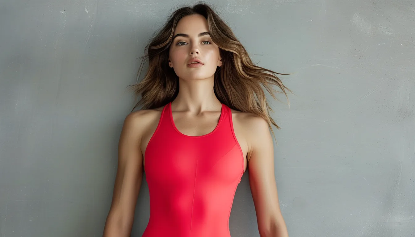
Why the Same Red Looks Warm With One Outfit and Harsh With Another
Quick Answer: Colour is judged relative to its surroundings, not in isolation. A red with a slight blue undertone looks warm next to a cooler blue-based navy and looks harsh next to a warm brown, because your eye reads the difference between them rather than the absolute value. The practical rule is to match undertone family, not to match colour: pair blue-based reds with cool neutrals like true black, charcoal, and cool grey, and orange-based reds with warm neutrals like camel, cream, olive, and brown.
You own one red piece and it has behaved completely differently in three outfits. That is not you being inconsistent about what you like.
This blog has covered the one-red-piece rule and why two reds in the same outfit rarely match. This is the mechanism that explains both, and it is the single most useful thing to understand about wearing a bold colour.

Why does red change depending on what is next to it?
Because your visual system measures contrast, not absolute colour.
Your eye adapts to whatever is dominant in the field of view. Colour perception constantly recalibrates against the surrounding average, which is why the same white paper looks white indoors under yellow light and outdoors under blue sky.
Simultaneous contrast pushes colours apart. Placing two colours side by side exaggerates their difference. A red with a hint of blue in it, placed next to a strongly warm brown, will read far bluer than it is, because your eye emphasises the gap.
Every red has an undertone, and almost nobody checks it. Reds run from orange-based, like tomato, brick, coral, and rust, to blue-based, like cherry, crimson, raspberry, and true burgundy. Two reds of the same apparent intensity can sit at opposite ends of that range.
Neutrals have undertones too, which is the part people miss. Black is not neutral in practice. True black is cool. Charcoal often has a blue cast. Camel, cream, and olive are warm. Navy varies enormously and is frequently cool.
So the interaction is between two undertones, not two colours. Warm red plus warm neutral reads harmonious and rich. Cool red plus cool neutral reads sharp and deliberate. Mixing across the two produces the muddy, slightly-off look that makes people conclude a piece does not suit them.
How do you tell if your red is warm or cool?
Three tests, none of which need any special knowledge.
1. The white paper test. Hold the garment against a sheet of plain white paper in daylight, away from a window with direct sun. Warm reds show visible orange at the edges; cool reds show a pink or purple cast. This is the most reliable single check.
2. The gold and silver test. Place a gold item and a silver item on the fabric. Warm reds sit comfortably with gold and look slightly wrong with silver. Cool reds do the reverse.
3. The comparison test. Put the piece next to any red you already know. Undertone is far easier to see as a difference than as an absolute. Two reds side by side make the warmer one obvious within seconds.
Then match the neutral:
- Warm red goes with camel, cream, tan, olive, chocolate brown, warm grey, and denim in mid-wash.
- Cool red goes with true black, charcoal, cool grey, crisp white, and blue-based navy.
- Both work with mid grey and most denim, which is why those combinations feel safe and slightly unremarkable.
Daylight is not optional for this. Store lighting is deliberately warm and flattering and will make almost any red look warm. If you cannot get to a window, take a photo near the door and check it later.
And check your own phone photos of past outfits. You almost certainly already own evidence of which combinations worked. The pattern is usually obvious once you know to look for undertone rather than for the colour itself.

Why does red photograph so differently from how it looks in the mirror?
Because cameras and eyes handle saturated red very differently.
Red is the channel most likely to clip on a camera sensor. A bright saturated red frequently exceeds what the sensor can record in that channel, which flattens the detail and makes the fabric look like a solid shape rather than a garment with texture.
Auto white balance reacts to a large block of colour. A big red area can pull the camera’s white balance in the opposite direction, shifting everything else in the frame and changing the apparent undertone of your red at the same time.
Your eye adapts and the camera does not. Standing in front of a mirror, your visual system settles into the room’s lighting within seconds. A photograph freezes one moment before any of that adaptation happens.
Screens then add another layer. Phone displays typically boost saturation, and each screen does it differently. The red you see in your gallery is not the red anyone else sees on their phone.
Which suggests a practical approach. If a red piece is for photos, shade or overcast light is far kinder than direct sun, and stepping back slightly reduces how much of the frame the red occupies. If it is for real life, judge it in a mirror by a window and ignore the photo entirely.
And when in doubt, less area of red solves both problems at once. A red accent holds its colour accurately in photographs where a full red outfit rarely does.
5 Mistakes People Make With a Red Piece
1. Buying it under store lighting. Retail lighting is warm and heavily flattering and will make a cool red look warm. Take it to a window or a doorway before deciding.
2. Assuming black goes with everything. True black is a cool neutral. Next to a warm brick red it creates a slightly jarring, cheap-looking contrast that people usually blame on the red.
3. Pairing it with navy without checking undertone. Navy ranges from very cool to almost warm. Red and navy is a classic pairing when the undertones match and looks distinctly off when they do not.
4. Wearing two different reds together. The odds that two separately bought reds share an undertone are poor, and simultaneous contrast will make even a small mismatch glaringly obvious. One red per outfit.
5. Judging it while wearing the wrong lipstick or nail colour. Any other red on you is competing in the same visual field, and the mismatch you are noticing may not be the garment at all.
And the one that surprises people: the same red genuinely does change with the seasons, because outdoor light shifts. Late-summer light is warm and golden, and a cool red that looked crisp in spring can read slightly purple in August evening light. Nothing is wrong with the garment.
FAQ: Wearing Red, Answered
How do I know if a red is warm or cool?
Hold it against plain white paper in daylight. Warm reds show an orange edge and cool reds show a pink or purple cast. A gold versus silver comparison confirms it.
What neutral goes best with a bright red?
Match the undertone. Blue-based reds go with true black, charcoal, and crisp white. Orange-based reds go with camel, cream, olive, and brown. Mid grey works with both, which is why it always looks safe.
Why does my red top look different in photos?
Saturated red often exceeds what a camera sensor can record and it also pulls the auto white balance, so the whole frame shifts. Shade or overcast light and a smaller area of red both help substantially.
TL;DR:
- Your eye judges colour by contrast with its surroundings, so red genuinely changes depending on what it sits next to.
- Every red has a warm or cool undertone, and so does every neutral including black and navy.
- Match undertone families: cool red with black, charcoal, and crisp white; warm red with camel, cream, olive, and brown.
- Test against white paper in daylight, and keep to one red per outfit.
When a red piece looks wrong, the problem is usually the neutral you paired it with, not the red you bought.
Keep Reading
This article is for general informational and styling purposes only. Fit, sizing, and product availability may vary.