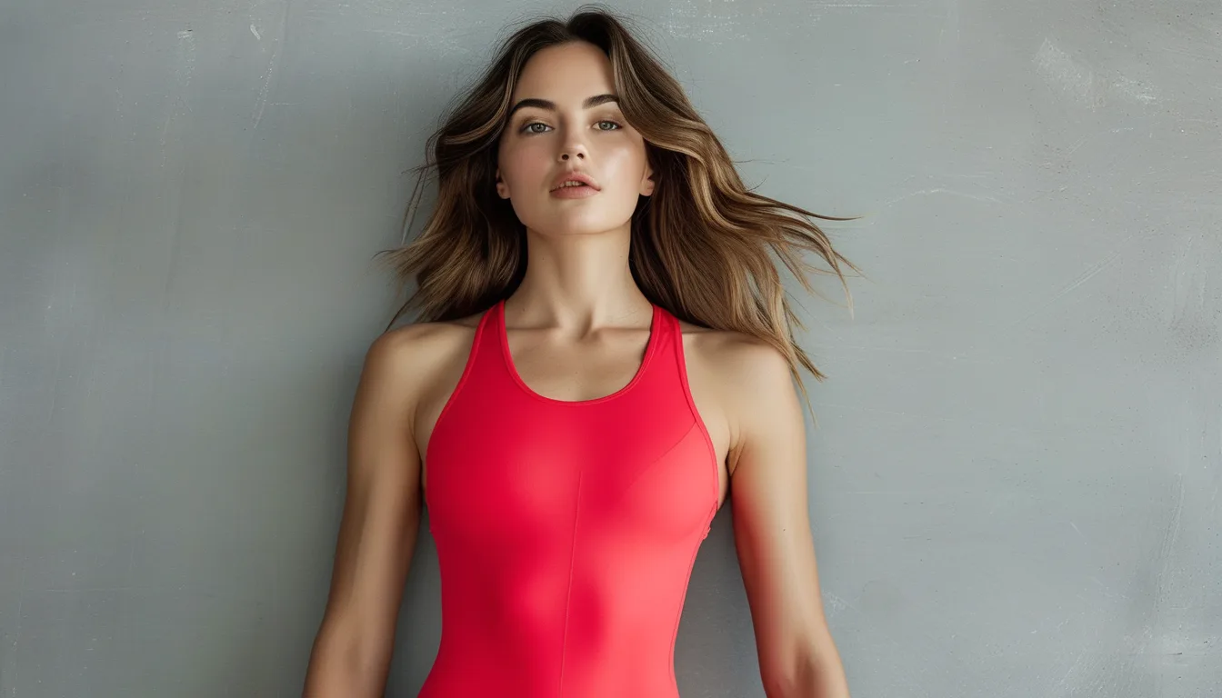
Why Your Red Piece Photographs Differently Than It Looks in the Mirror
Quick Answer: Cameras handle saturated red badly - it is the colour most likely to clip, meaning the sensor records the red channel at maximum and loses all the detail that your eye can still see. Your eye adapts to the light in the room; the camera applies a single white balance to everything. Result: a red that reads deep and textured in person reads flat and glowing in a photo. The practical fix is to control light and distance rather than to avoid red.
This is not a flaw in your outfit and it is not a flaw in your phone.
It is a known limit of how digital sensors record the most saturated part of the spectrum.
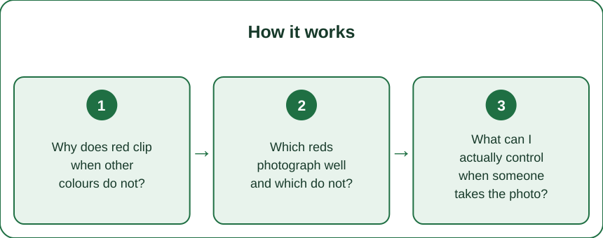
Why does red clip when other colours do not?
Because of how sensors are built and how much red is in ordinary light.
A digital sensor records three channels - red, green, and blue - and each one has a ceiling. When a channel hits that ceiling it stops recording differences. Everything above the limit becomes the same value, which is why a red jacket loses its folds and seams and becomes a single flat shape.
Red hits that ceiling first for two reasons. Standard sensors have twice as many green photosites as red or blue, so green has more information to work with and red has less. And most indoor light and late-afternoon daylight is warm, meaning it already contains a lot of red energy, which pushes the channel toward its limit before you have even added a red garment.
Your eye does not work this way at all. Human vision adjusts locally and continuously - you can look at a bright red surface and a dim one in the same room and see detail in both. A camera applies one exposure and one white balance to the entire frame.
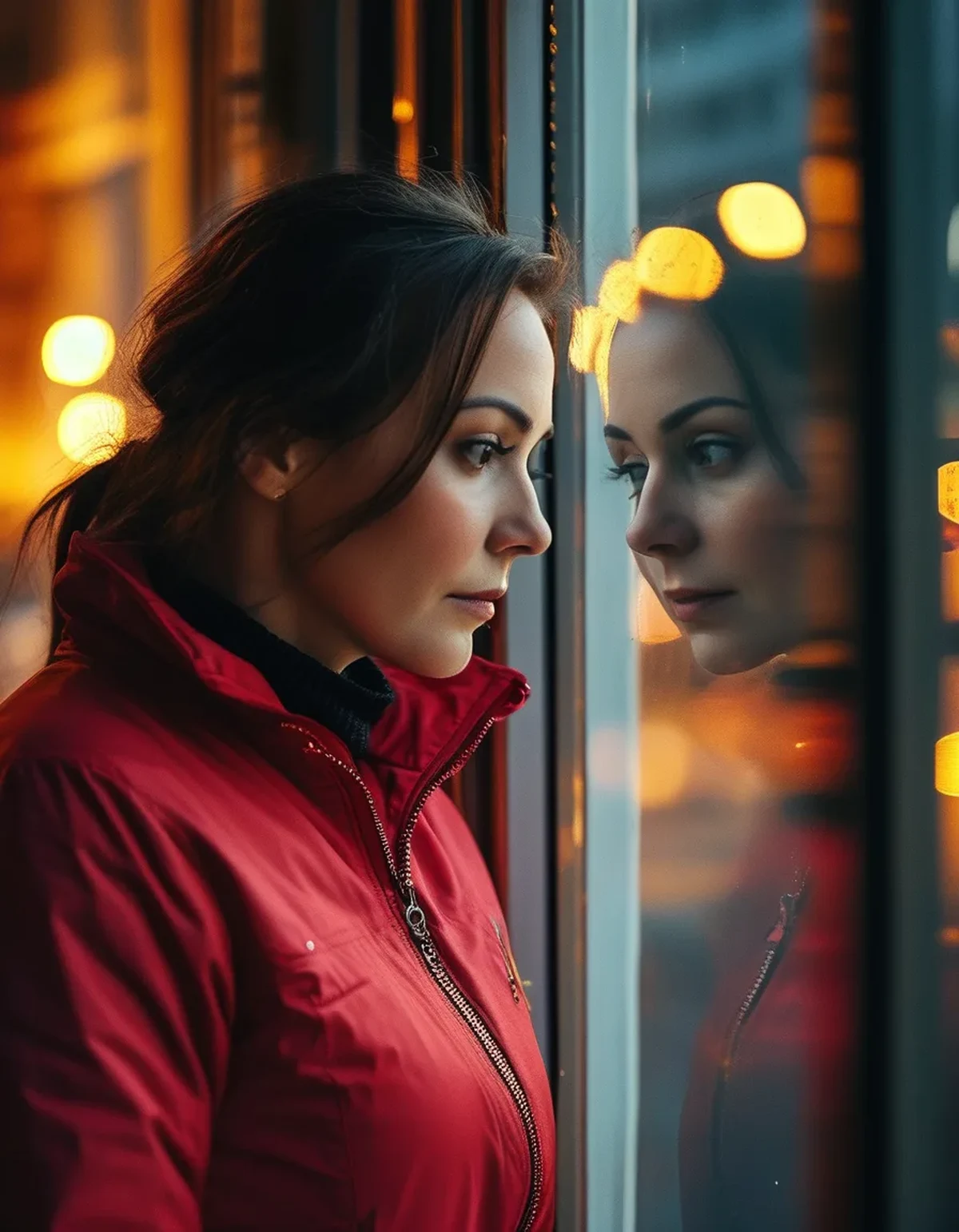
The practical signature of clipping: the red looks like a sticker. No shadow inside the folds, no visible texture, an unnaturally hard edge where the garment meets the background. Once you know what it looks like, you see it in half the photos on your feed.
Which reds photograph well and which do not?
Undertone and saturation both matter, and saturation matters more.
Very saturated pure reds - the fire-engine and true-red family - are the most likely to clip. They also produce the most colour spill, which is the faint red cast that appears on your jaw and neck in a photograph.
Reds with something else in them behave far better. A brick red, a rust, a terracotta, or a slightly muted cherry all sit below the clipping threshold. They photograph close to how they look in person, which is the whole goal.
Cool-leaning reds photograph more predictably than warm-leaning ones under artificial light, because most indoor light is already warm and pushes warm reds further. A blue-based cherry or a true crimson holds up better in a restaurant than a warm orange-red does.
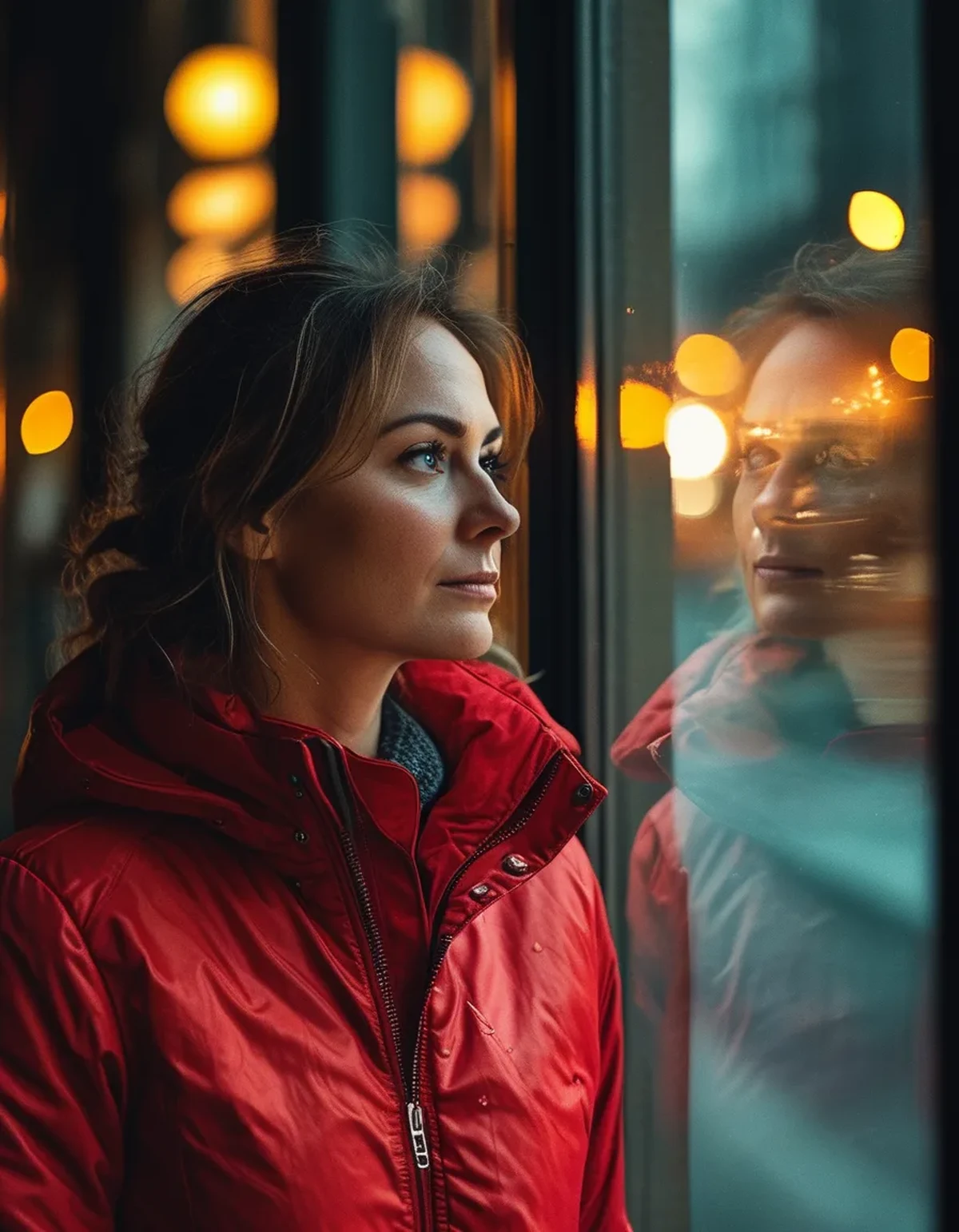
Fabric changes the result as much as the dye. Matte fabric scatters light and holds detail; shiny fabric produces hot specular highlights that clip locally even in a well-exposed frame. A matte red knit and a satin red top in the same colour are two entirely different photographic problems.
And texture is your ally. Ribbing, cable, seam lines, and weave give the sensor variation to record. A perfectly smooth red surface has nothing to hold on to and flattens first.
What can I actually control when someone takes the photo?
Five things, in rough order of impact.
1. Get out of direct sun. Direct light on saturated red is the fastest route to clipping. Open shade, an overcast sky, or indirect window light preserves the colour far better - and it also solves the harsh shadow problem at the same time.
2. Do not stand in the brightest part of the frame. If the red is the brightest thing the camera sees, exposure will fight it. Standing near a mid-tone background gives the camera a more balanced scene.
3. Break up the red. A red jacket over a neutral top with the jacket open photographs better than a full red column. You are reducing the total area of the clipping colour, which helps the automatic exposure make a better choice.
4. Tap to set exposure on the red, not on the face. On a phone, tapping the red area and dragging exposure down slightly recovers detail. You can lift the face afterwards; you cannot recover a clipped channel at all. This is the single most useful trick here.
5. Watch the distance to walls. Red bounces strongly. Standing close to a white wall in a red top sends a red cast across your face and the wall. A step or two of separation removes it.
And if you are shooting yourself: use the main camera rather than the ultra-wide. Wider lenses generally have smaller apertures and more aggressive processing, which handles saturated colour worse.
Myth vs Fact: Wearing Red in Photos
Myth: Red is unflattering in photos. Fact: Saturated red is difficult to expose. That is a technical problem with technical solutions - shade, exposure compensation, and a less saturated shade all fix it.
Myth: The camera shows the truth and the mirror flatters you. Fact: For red specifically, your eye is the more accurate instrument. It resolves detail the sensor physically cannot record. The mirror is right; the photo is clipped.
Myth: You can fix it in editing. Fact: You can fix an underexposed red and you cannot fix a clipped one. Once a channel is at maximum, the information is gone. Editing a clipped red just makes a darker flat shape.
Myth: Red always makes you the centre of attention in a group photo. Fact: True - and it is worth deciding on purpose. In a group shot, the red garment draws the eye first regardless of position. Use it when you want that; choose brick or rust when you do not.
Myth: Phone cameras are worse at this than real cameras. Fact: Phones are often better because computational processing recovers more highlight information than a single exposure. The failure mode is the same, but the threshold is higher.
Does light change through the year in a way that matters here?
Yes, and late summer into fall is the most flattering stretch of the year for red.
Sun angle drops as the season moves on. Lower sun means light passes through more atmosphere, which warms it and softens it. Softer light is less likely to clip a saturated red, and warmer light makes brick and rust tones look their best.
The golden hour window widens as fall approaches, so the practical shooting window for outdoor photos gets longer and more forgiving. This is the opposite of high summer, when harsh overhead light at midday is the hardest possible condition for red.
Autumn backgrounds compete with red, though. Once leaves turn, a red jacket against orange foliage loses separation and the whole frame reads as one warm mass. A grey street, a green space, or a dark doorway restores the contrast that makes the red piece do its job.
Indoor light shifts too. As days shorten, more photos are taken under artificial light, which is warmer and further pushes red toward clipping. This is when a cool-leaning cherry or a muted brick clearly outperforms a bright warm red.
The seasonal recommendation, plainly: keep the loud saturated red for daylight and open shade, and lean on brick, rust, and cherry as the light gets warmer and more artificial. They photograph as they look, which is the whole point of buying a colour you love.
FAQ: Red and Photography Questions, Answered
Should I just avoid red for photos entirely?
No. Choose a slightly less saturated red and stand in open shade and the problem largely disappears. Red remains the single most effective attention colour in an outfit, which is worth managing for.
Why does my red look orange in some photos?
White balance. Warm indoor light plus an automatic white balance that is fighting a large red area often shifts the whole render. Setting a manual white balance, or shooting near a neutral object the camera can reference, fixes it.
Does a red lip have the same problem?
A smaller version of it. The area is tiny, so clipping matters less, but the colour spill is the same - a bright red lip can cast faint colour on the chin under close, bright light. Matte formulas photograph more reliably than glossy ones.
TL;DR:
- Cameras clip saturated red first, losing the detail your eye still sees.
- Warm indoor and late-day light already contains a lot of red, which brings the ceiling closer.
- Brick, rust, and cherry photograph close to how they look; fire-engine red rarely does.
- Open shade, a mid-tone background, and tapping to expose for the red solve most of it.
- Matte and textured fabric holds detail; smooth and shiny flattens first.
Next photo in red, step into shade and drag the exposure down a touch before you shoot. That one habit fixes most of this.
Keep Reading
This article is for general informational and styling purposes only. Fit, sizing, and product availability may vary.