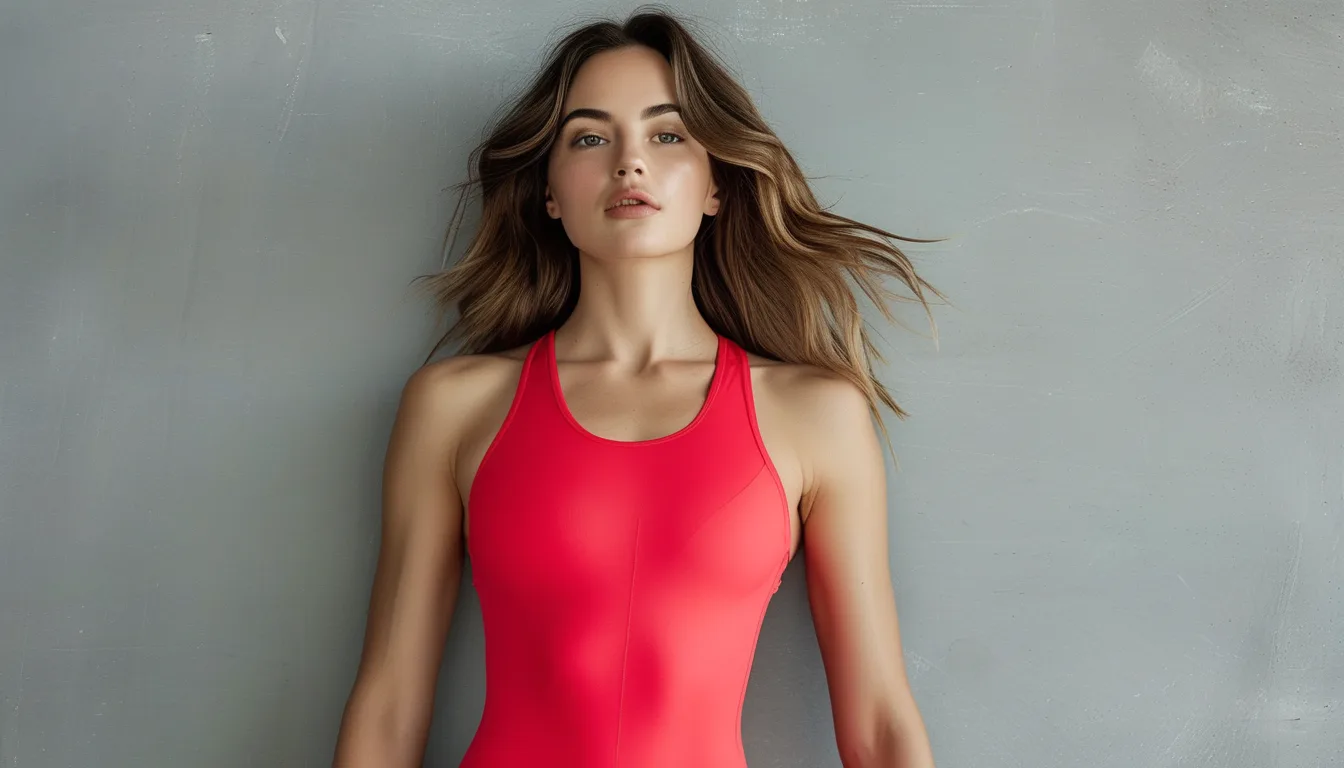
Why Red Looks Different in Every Shop You Try It In
Quick Answer: Red shifts more than any other colour under different lighting because most artificial light is deficient in the deep-red end of the spectrum. Shop LEDs and warm incandescent bulbs render red inconsistently, so the same garment can look orange-red, true red or brown-red depending on the fixture overhead. The only reliable test is daylight — take the piece to a window or door, because that is the light you will actually wear it in.
You tried it on and it was a perfect deep red.
At home it is somehow rusty. In photographs it is almost orange.
The garment did not change. Six different light sources did.

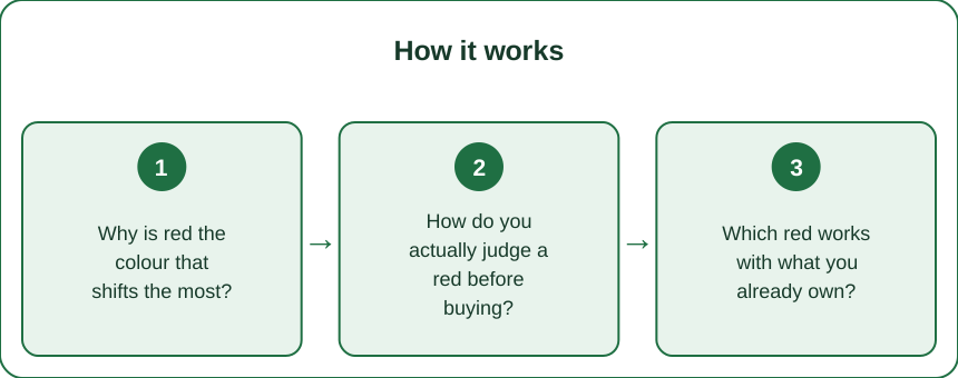
Why is red the colour that shifts the most?
It comes down to how light sources are built and how the eye handles long wavelengths.
Most LEDs are weak in deep red. A standard white LED is a blue chip with a phosphor coating, and its output falls off sharply above roughly 630 nanometres — precisely where deep reds live. Those reds have less light to reflect.
Warm bulbs push red the other way. Incandescent and warm-white light is rich in the long wavelengths, so it saturates and warms reds, making brick look scarlet.
CRI is rarely good in retail. Colour Rendering Index measures faithfulness, and the red-specific score is the one that fails most often. Many shop fittings prioritise brightness and efficiency over red accuracy.
Red has the widest perceptual family. Between orange-red and blue-red sits an enormous range that we call one word. Small physical shifts cross visible category boundaries.
Fabric surface amplifies it. Matte fabrics scatter and read flatter and darker; satin and technical fabrics reflect specularly and read brighter and more orange under the same light.
And your eye adapts. After five minutes in a warm-lit shop your colour adaptation has shifted, so you are not even comparing against a stable reference.
How do you actually judge a red before buying?
Three checks, all free, all fast.
Take it to daylight. Walk to the shop door or a window. Daylight is the only common full-spectrum reference and it is the light you live in.
Photograph it with the flash off. Your phone camera’s white balance approximates a neutral reference and will show the undertone more consistently than your adapted eye.
Compare against something you own. Hold it against a garment you already know. Relative judgements are far more reliable than absolute ones.
Check the undertone against your other reds. Blue-reds (cherry, wine, raspberry) and orange-reds (tomato, coral, brick) rarely sit well together. Knowing which family you already own prevents the piece that never gets worn.
Look at it in shadow as well as light. Deep reds go nearly black in low light, which changes how the piece works in a restaurant or an evening.
And check it against your skin, not the hanger. Red reflects onto skin more strongly than any other colour, which is exactly why the right red is so effective and the wrong one so obvious.
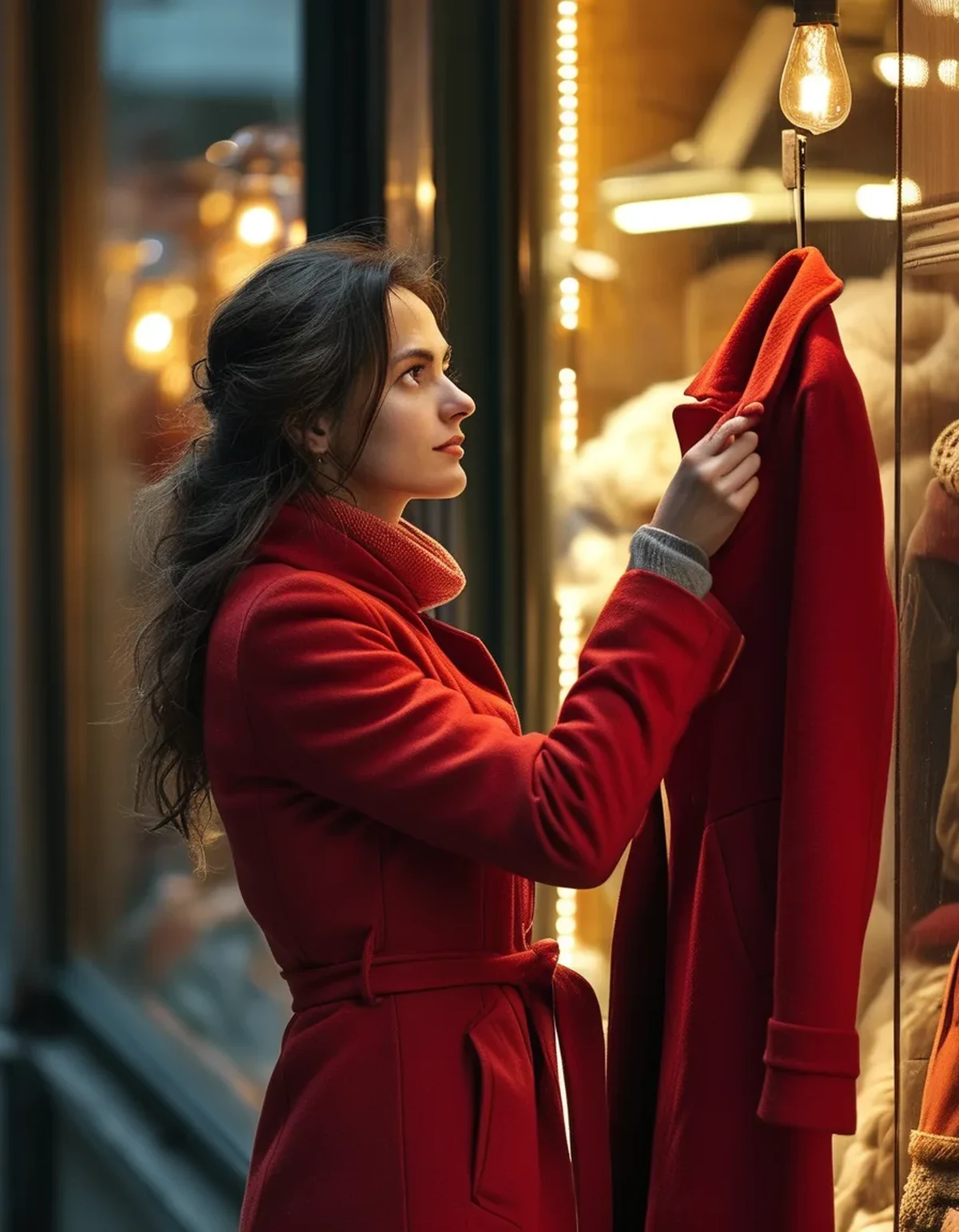
Which red works with what you already own?
The useful division is undertone, not shade name.
Blue-reds — cherry, wine, raspberry, crimson. They sit naturally with cool neutrals: grey, navy, charcoal, cool white, black.
Orange-reds — tomato, brick, rust, coral. They belong with warm neutrals: camel, cream, olive, brown, denim.
True red sits in the middle and is the most versatile, which is why a classic red coat or bag holds value across a wardrobe.
Mixing the two families is the single most common red mistake. A cherry top under a rust jacket reads as an error rather than a choice, because the eye is very good at detecting near-misses.
One red per outfit is the safe rule. Two reds must either match exactly or be far enough apart to read as deliberate contrast.
Seasonal note: as summer turns, the wearable reds shift from bright tomato and coral toward deeper brick, wine and burgundy. It is one of the clearest seasonal colour transitions there is, and it is happening now.
Myth vs Fact: Wearing Red
Myth: red suits some people and not others. Fact: nearly everyone suits a red. The variable is undertone, not whether red works at all.
Myth: red always draws attention. Fact: deep wine and brick read as quiet neutrals in an autumn wardrobe. Only bright saturated reds command attention.
Myth: red and pink clash. Fact: red with pink is a long-established pairing and works reliably when both share an undertone.
Myth: you cannot wear red with red hair. Fact: you can, and it is striking — the requirement is separating the undertones, usually by choosing a blue-red.
Myth: red photographs badly. Fact: red is the colour most affected by camera sensor and white balance, and it clips to a flat blob under strong direct light. It photographs beautifully in soft, indirect light.
Myth: red fades faster than other colours. Fact: this one is true. Red dyes, particularly on cotton, are more prone to UV fading and bleeding. Wash cold, inside out, and dry out of direct sun.
FAQ: Red Colour Questions, Answered
How do I tell if a red is blue-based or orange-based?
Hold it next to a pure white sheet of paper. Blue-reds look slightly purple against white; orange-reds look slightly warm or brown.
Why does my red look different in photos than in the mirror?
Camera sensors oversaturate red and often clip the detail. Photograph in indirect light and expect the true colour to sit slightly deeper than the image.
Can I wear two different reds together?
Only if they share an undertone, or if they are far enough apart to read as intentional. Near-misses look like mistakes.
Does red really fade faster?
Yes. Red dye molecules are more UV-sensitive. Cold washes, inside out, and drying in shade meaningfully extend the life.
What red is most versatile?
A true mid-red for brights, or a deep wine for autumn and winter. Both cross more of a wardrobe than a coral or a scarlet.
Why do my red pieces look worse in the evening?
Warm evening lighting saturates reds and can push a deep red toward brown. It is a lighting effect, not the garment ageing.
TL;DR:
- Red shifts most under different lighting because most LEDs are deficient in deep red and warm bulbs oversaturate it.
- Judge every red in daylight, at a window or door, before buying.
- Sort by undertone: blue-reds with cool neutrals, orange-reds with warm ones.
- Near-miss reds clash worse than obviously different ones — one red per outfit is the safe rule.
- Red genuinely fades faster: wash cold, inside out, dry out of the sun.
Next time, carry it to the door. Ten seconds of daylight tells you more than ten minutes in the fitting room.
Keep Reading
This article is for general informational and styling purposes only. Fit, sizing, and product availability may vary.