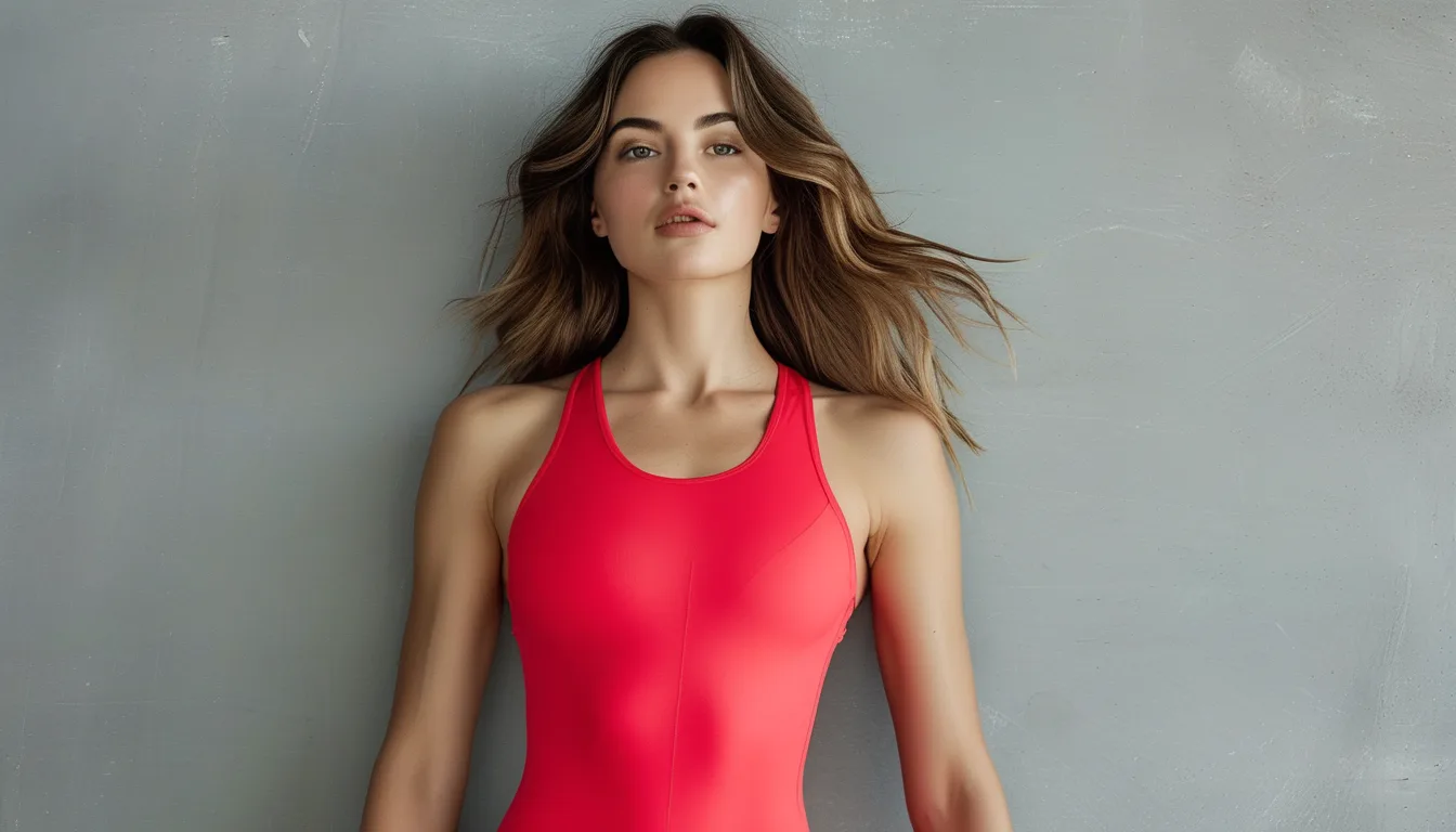
Why Red Activewear Needs a Different Neutral in Autumn
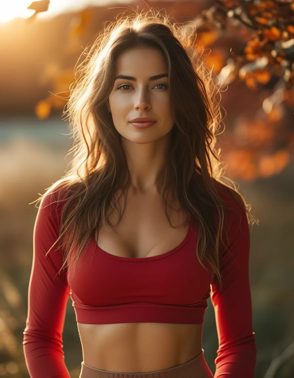
Quick Answer: Red reads differently depending on what sits beside it - a cool neutral like true black or stark white pushes red toward its blue side and makes it look sharper and colder, while a warm neutral like camel, cream, or chocolate pulls red toward its orange side and makes it look richer. In warm autumn light, the cool pairing gets harsher while the warm pairing gets better. Same red, different neighbour, completely different result.
Here is which neutrals to move to, and why the swap costs you nothing.
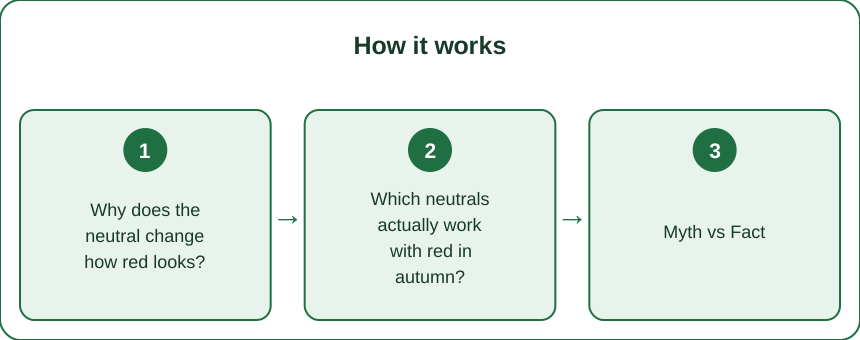
Why does the neutral change how red looks?
Because colour perception is comparative, not absolute.
Your visual system judges colour relative to its surroundings. Simultaneous contrast means a colour appears to shift toward the opposite of whatever is next to it. Put red against a cool neutral and the red is pushed toward its warm end; put it against a warm neutral and the red is pushed cooler. The direction is counterintuitive and it is well documented.
In practice, the visible effect people report is the opposite-seeming one: black and stark white raise contrast dramatically, which reads as sharpness and hardness rather than warmth, and that is what dominates the impression. High contrast is the loudest signal in the pairing.
Warm neutrals lower that contrast. Camel, cream, oatmeal, chocolate, and warm greys sit closer to red in both value and temperature, so the combination reads harmonious rather than graphic.
Then autumn light amplifies it. Warm low-angle daylight is already pushing everything warmer. A warm neutral goes with that shift; a cool neutral fights it, and the mismatch is what reads as ‘off’.
And red is unusually sensitive to this because it sits at the extreme end of the warm range. A colour near the middle of the spectrum has room to absorb a shift; red does not - which is exactly why people find it the hardest colour to style consistently.
Which neutrals actually work with red in autumn?
Ranked by how reliably they work.
Camel and tan. The strongest autumn pairing with red. Both are warm, the value contrast is moderate rather than extreme, and they share an orange undertone. A red top with camel leggings or a camel jacket reads deliberate in a way that black does not in September.
Chocolate and deep warm brown. The current alternative to black, and it works particularly well with warm reds and rust-leaning shades. It gives you the anchoring effect of a dark neutral without the coldness.
Cream and oatmeal, rather than stark white. Same brightening role, without the harsh contrast edge. Cream also holds up better against warm light, where true white picks up a cast and reads dingy anyway.
Olive. Not a neutral in the strict sense, but it functions as one. Olive and red are near-complementary, which makes the red look richer without the graphic hardness of black, and olive is inherently autumnal.
Warm grey - greige - rather than cool grey. Cool grey next to red tends to look slightly blue and dulls the red. Warm grey keeps the red alive while staying genuinely neutral.
And black still works, but with a condition: it works best with deep, blue-leaning reds - burgundy, wine, cherry - rather than with bright orange-leaning reds. Black plus bright coral-red is the specific combination that stops working in autumn light, and it is the one most people are wearing.
What to avoid: stark white and cool grey with a bright warm red. Maximum contrast, maximum temperature clash, and the least forgiving in low warm light.
Myth vs Fact: Styling Red
Myth: Red goes with everything because it is a classic. Fact: Red is one of the least forgiving colours to pair, precisely because it sits at the extreme warm end. The undertone of your specific red - orange-leaning or blue-leaning - determines what works, and ‘red’ as a category tells you almost nothing.
Myth: Black is the safe neutral. Fact: Black is the high-contrast neutral, which is a different thing. It is safe with deep blue-leaning reds and genuinely difficult with bright warm ones, especially in low-angle autumn light where the temperature mismatch is exaggerated.
Myth: Two reds in one outfit always clash. Fact: Two reds clash when their undertones differ - one orange-leaning, one blue-leaning. Two reds from the same undertone family, separated in value, work well. The clash is about temperature, not about repetition.
Myth: You should limit red to one small accent. Fact: A single accent is a reliable default, not a rule. A large block of red with a warm neutral works well and often better, because it stops the red reading as an afterthought. The failure mode is scattered small amounts of red, which reads unresolved.
Myth: Red fades because it is a cheap dye. Fact: Red dye molecules are genuinely less photostable than most, across price points. Red does fade faster than navy or black regardless of what you spend - which is an argument for washing it inside out in cool water, not for buying differently.
The one that surprises people: the neutral you pair with red changes the perceived brightness of the red more than changing the red itself would. Swapping black leggings for camel does more than buying a different red top.
How do you build the swap without buying much?
Three garments cover most of it.
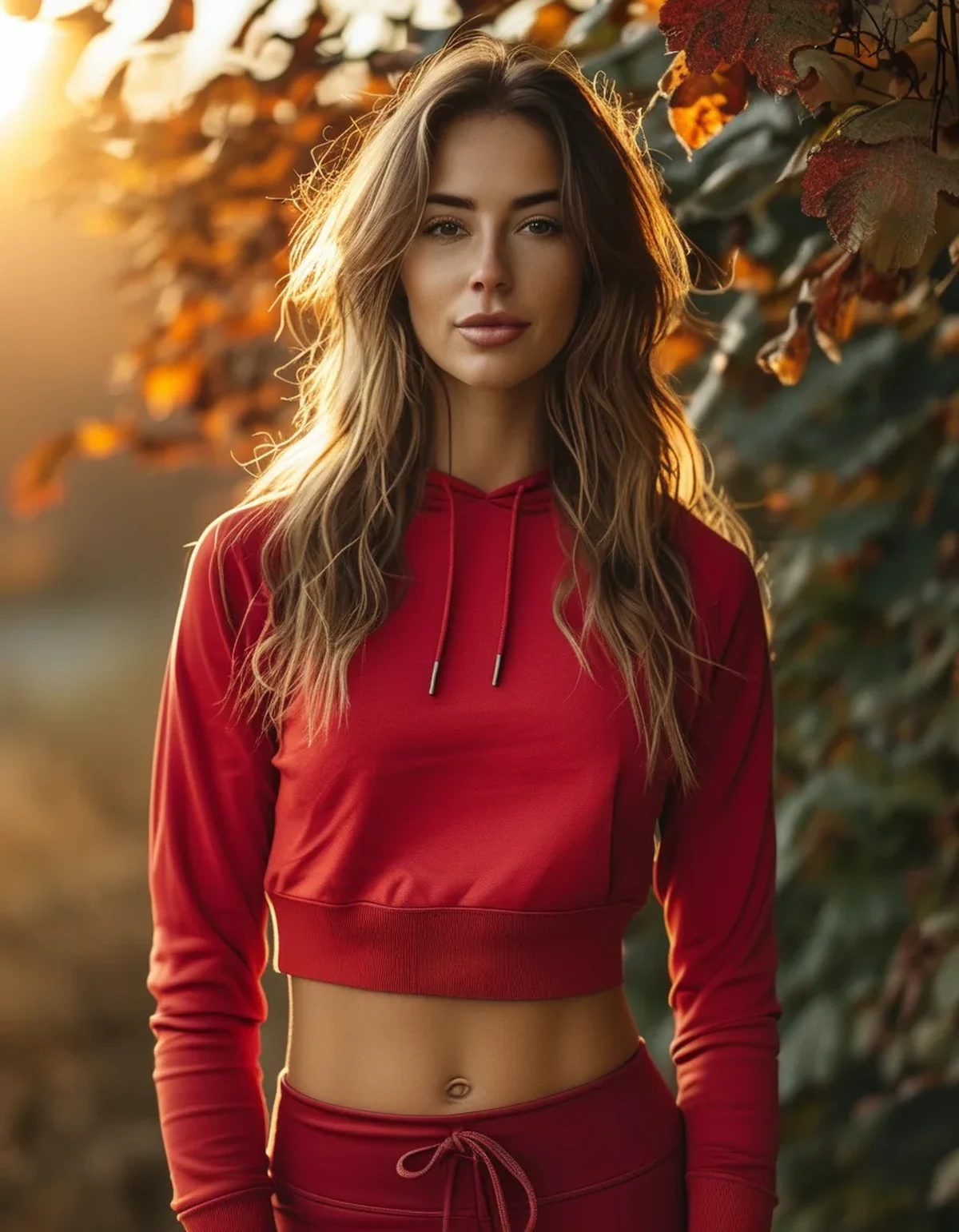
One pair of warm-neutral bottoms. Camel, chocolate, or warm taupe leggings or joggers. This is the highest-leverage single purchase because bottoms are the largest colour block in most activewear outfits.
One cream layer. A cream sweatshirt, zip-up, or long-sleeve. Replaces the white one for the season and works with every red you own.
One olive piece. Jacket, leggings, or a shacket. Olive is the item that makes red look expensive and it works with everything else on this list.
Then use black deliberately rather than by default. Keep it for deep reds, for evening, and for when you want the graphic contrast. The problem was never black itself; it was black as an unconsidered default.
Switch metal and accessory tones too. Gold-tone hardware, tan trainers rather than white, and a warm-toned bag. Small surfaces, but they set the temperature of the whole outfit.
And identify your red’s undertone before you commit. Hold it against a true orange and against a true purple. Whichever it looks more comfortable next to tells you its lean - orange-leaning reds want camel and cream; blue-leaning reds can take black, grey, and even navy.
One practical note on shopping: red is the colour most distorted by shop lighting and by screens. Check it in daylight before deciding, and expect an online red to arrive looking different from the photograph - it almost always does.
Does any of this apply to performance wear specifically?
A few practical points that are not about aesthetics.
Red shows sweat marks differently from other colours. Wet red fabric darkens substantially, so sweat patterns are more visible on mid-tone red than on black or on very dark shades. If that matters to you, a deeper red or a textured knit hides it better than a flat bright one.
Red fades unevenly under chlorine and sun, which is why old red activewear often looks patchy rather than uniformly faded. Washing inside out in cool water, and drying out of direct sun, slows this meaningfully.
Visibility is a genuine advantage. For outdoor running as the evenings draw in, red is far more visible than black or olive in daylight - though for actual low-light safety, fluorescent yellow-green plus reflective material outperforms red substantially, since red darkens dramatically at dusk.
And warm neutrals show dirt more than black. Camel and cream leggings are practically less forgiving on a muddy autumn trail. A pragmatic split is warm neutrals for gym and studio, dark neutrals for outdoors, which also happens to be a sensible way to make the wardrobe work harder.
Care, briefly: wash red separately for the first few washes, cool water, inside out, no fabric softener, and air dry. Red is the colour most likely to transfer dye, and heat accelerates both fading and elastane degradation.
The overall point: the seasonal shift here costs nothing to implement if you already own a warm neutral, and it changes how everything red in your wardrobe reads for the next three months.
FAQ: Red and Neutrals, Answered
Why does my red-and-black outfit suddenly look harsh?
Black creates maximum value contrast, which reads as sharpness. In warm low-angle autumn light, that contrast fights the overall warmth of the scene, and the mismatch reads as harshness even though nothing about the garments changed.
What is the single best neutral for red in autumn?
Camel. It is warm, shares an orange undertone with most reds, and creates moderate rather than extreme contrast. Chocolate brown is a close second and works as a black substitute.
Can I still wear black with red?
Yes - particularly with deep, blue-leaning reds like burgundy, wine, or cherry. The combination that struggles is black with a bright, orange-leaning red in warm daylight.
How do I tell what undertone my red is?
Hold it next to a true orange and then next to a purple. Whichever it sits more comfortably beside indicates its lean. Orange-leaning reds want warm neutrals; blue-leaning reds tolerate cool ones.
Do two reds in one outfit ever work?
Yes, when they share an undertone and differ clearly in value - a deep burgundy with a brighter warm red, for example. The clash comes from mixing a warm red with a cool one, not from repeating the colour.
Why does red fade faster than my other activewear?
Red dye molecules are generally less photostable than others, across price points. Washing inside out in cool water, skipping fabric softener, and drying away from direct sun slows it considerably.
TL;DR:
- Red is judged relative to what sits beside it - the neutral changes the red more than the red changes itself.
- Black and stark white create maximum contrast, which reads harsh against warm autumn light.
- Move to camel, chocolate, cream, olive, or warm grey - all warm, all moderate-contrast, all working with the season’s light rather than against it.
- Black still works with deep blue-leaning reds (burgundy, wine, cherry); it struggles with bright orange-leaning ones.
- Check your red’s undertone by holding it against a true orange and a true purple - that determines everything else.
- Three purchases cover the shift: warm-neutral bottoms, a cream layer, one olive piece, plus gold-tone hardware and tan trainers.
- Practical notes: red shows sweat more, fades faster, and is visible in daylight but not at dusk - reflective material beats red for evening runs.
You probably do not need a different red. You need a different pair of leggings.
See It in Motion
Seen here: Super High Waist Embossed Yoga Leggings with Inner Pocket — shop it on bubblelime.com
Keep Reading
This article is for general informational and styling purposes only. Fit, sizing, and product availability may vary.