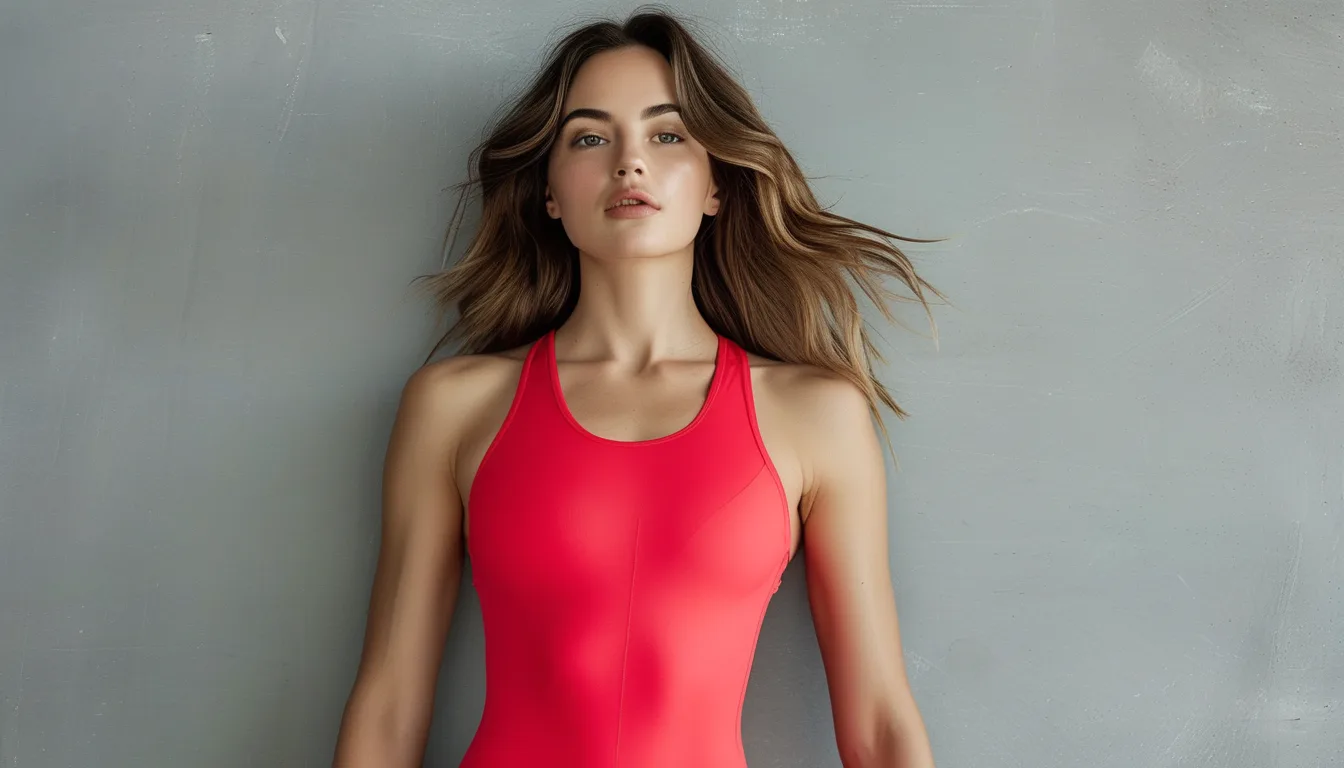
The One-Red-Piece Rule: Why a Single Bold Color Works Better Than a Full Bright Outfit
Quick Answer: A single saturated color against a neutral base draws the eye to one clear focal point and reads as a deliberate choice, while an outfit built from multiple bright colors forces the eye to jump between several equally intense areas with no clear hierarchy — which reads as visually busy or accidental rather than styled. The fix is picking exactly one piece to carry the color and letting everything else stay quiet.
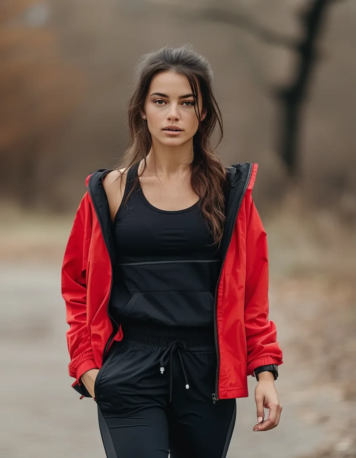
You’ve probably noticed that a single red jacket over an all-black outfit looks like it was styled by someone who knows what they’re doing, while a bright red top with bright blue leggings can look like you got dressed in the dark. The difference isn’t taste — it’s how your eye is physically wired to process color contrast.
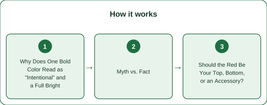
Why Does One Bold Color Read as “Intentional” and a Full Bright Outfit Read as Chaotic?
Your eye is drawn to the point of highest contrast in any scene — this is a basic principle of visual perception called saliency, and it’s the same mechanism designers use to guide your attention through a poster or a website. Against a field of neutral, low-saturation color (black, gray, white, beige, olive), a single highly saturated piece becomes the obvious point of highest contrast. There’s nothing competing with it, so your eye goes straight there, registers it, and then takes in the rest of the outfit as a supporting frame. The result reads as composed — one clear subject, one clear “point” the outfit is making.
When you introduce a second or third saturated color, you create multiple competing points of high contrast with no clear hierarchy between them. Your eye doesn’t know where to land first, so it darts between the red top, the blue leggings, the yellow shoes, trying to establish which one is “the point.” That visual searching is what reads, almost instantly and subconsciously, as busy or unresolved — even to someone who couldn’t articulate why.
This is the exact same principle used in photography and film composition (a single red object in an otherwise muted frame is a classic technique to direct viewer attention), in graphic design (one accent color against a neutral palette), and in retail visual merchandising (one bold item per mannequin, styled with neutrals). It’s not a fashion rule invented for clothing specifically — it’s a general principle of how human vision processes contrast, applied to an outfit.
The practical implication: a bright outfit isn’t “too much color,” it’s too many focal points. You can absolutely wear multiple bold colors together if you have a strong reason to, but doing it well requires very deliberate control over value and placement — which is a much harder styling problem than choosing one accent and letting neutrals do the rest of the work.
Myth vs. Fact: Is More Color Always More Visual Impact?
Myth: If one bold color gets attention, two or three bold colors must get even more attention — more color equals more impact.
Fact: Impact comes from contrast, not color quantity, and contrast is a relationship between elements — it requires something quiet for the bold element to stand out against. Once you add a second saturated color, you’re not adding more impact, you’re splitting the impact you already had. Each additional bold color dilutes the “pop” of the others, because now the eye has to divide its attention instead of focusing.
Think of it as a fixed budget of visual attention in any given outfit or frame. One red piece against black spends that entire budget making the red look striking. Three bold colors split the same budget three ways, and none of them get the full effect any single one would have gotten alone. This is why an all-neutral outfit with one red piece almost always photographs and reads as more “put together” than an outfit with three bold colors, even though the second outfit technically has more color in it.
There’s a real exception worth naming: monochromatic bright looks (several shades of the same bold color family — say, tomato, brick, and coral together) don’t trigger the same competing-focal-point problem, because they read as a single color story rather than multiple competing ones. The rule isn’t “avoid bright colors,” it’s “avoid multiple different bold hues fighting for attention in the same look.”
Should the Red Be Your Top, Bottom, or an Accessory?
Where you place the red changes what it communicates and how it’s read, because the eye tends to travel in a particular order through an outfit — usually upper body first, especially the area nearest the face.
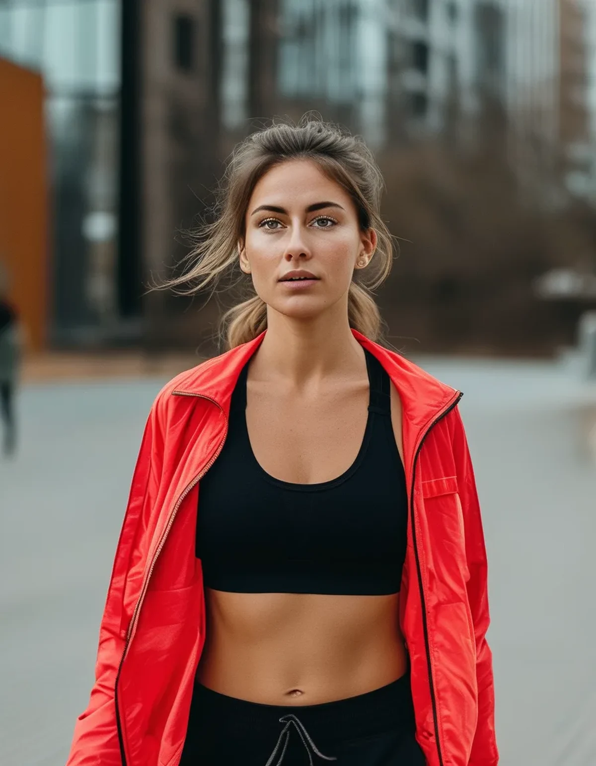
Red on top (sports bra, jacket, or tank) draws attention upward, toward your face — it’s the most flattering placement if you want the color to complement your complexion, since it sits close enough to your skin to reflect a little warmth onto your face the way any near-face color does. It’s also the boldest, most “worn on purpose” placement, since tops are the first thing registered in a head-to-toe glance.
Red on the bottom (leggings or shorts) is a slightly quieter statement — it still functions as the focal point, but because legs are viewed after the face and torso in a typical glance, it reads as more grounded and less attention-seeking. This placement works particularly well if you want a bold color without it feeling like the centerpiece of the whole look, or if you’re wearing a top you don’t want to compete with.
Red as an accessory (jacket tied at the waist, a bag, shoes, a headband) is the lowest-commitment version of the rule — you still get the single-focal-point effect, but in a smaller, more contained dose. This is the best entry point if you’re not used to wearing bold color and want to test the effect before committing to a full red top or bottom.
There’s no wrong placement — the rule works at all three levels, because the underlying mechanism (one saturated point against neutrals) stays the same regardless of which garment carries it.
How Does Red Interact With Different Neutral Base Colors?
Not all neutrals showcase a red accent identically — the value (lightness/darkness) and undertone of your base color changes how the red reads.
Black bases create the highest possible contrast with red, making the accent piece feel bold, graphic, and high-energy. This is the classic, safest pairing because black has essentially no competing undertone to clash with red’s warmth.
Gray bases soften the contrast slightly compared to black, giving the red a more balanced, editorial feel rather than a high-drama one — useful if you want the red to read as sophisticated rather than statement-making.
Beige, sand, and other warm neutrals create a genuinely different effect: because these bases share red’s warm undertone family, the red feels integrated into the outfit rather than starkly contrasted against it — more cohesive, less graphic. This pairing tends to photograph particularly well in natural light, since warm neutrals and red both hold up well under daylight color temperature.
White bases create high contrast similar to black but with a cleaner, crisper feel — good for a fresh, high-visibility look, though white shows more wear and requires more upkeep to stay looking sharp next to a bold accent.
Olive and other cool-leaning neutrals create the most tension with red, since olive’s green undertone sits opposite red on the color wheel — this isn’t necessarily bad (complementary colors are a classic, intentional pairing), but it reads as more fashion-forward and less quietly polished than the warm-neutral pairing.
FAQ: Bold Accent Color Styling Questions, Answered
Can I ever wear two bold colors together and have it work?
Yes, if they’re from the same color family (tonal, like brick and coral) or if you deliberately use value to create hierarchy — one large muted-bright area and one small, more saturated pop. The rule against multiple brights applies mainly to two or more equally saturated, equally sized, differently-hued pieces competing for attention at the same intensity.
Does the “one bold piece” rule apply to prints too?
Generally yes — a busy, multi-color print functions visually like multiple bold colors at once, so pairing a print with additional saturated solids usually recreates the same competing-focal-point problem. Prints tend to work best against solid neutrals, the same way a single bold color does.
Is red specifically better for this rule than other bold colors?
Red has the highest visual salience of almost any color to the human eye — it’s processed faster and noticed first in a scene more consistently than most other hues, which is part of why it’s such an effective single accent. Other saturated colors (cobalt, emerald, hot pink) follow the same one-piece principle, just with slightly less inherent attention-grabbing power than red specifically.
What if I want to wear red for a low-key day, not a statement look?
Choose the accessory placement (bag, shoes, a tied-on layer) rather than a top or bottom, and pair it with a mid-value neutral like gray rather than high-contrast black — this keeps the effect present but turns the volume down.
TL;DR:
- One saturated color against neutrals creates a single clear focal point; multiple bright colors create competing focal points that read as visually busy.
- Impact comes from contrast, not color quantity — adding more bold colors dilutes the effect rather than multiplying it.
- Red placement changes the message: tops draw the eye upward and flatter the face, bottoms feel grounded, accessories are the lowest-commitment entry point.
- Warm neutrals (beige, sand) integrate red for a cohesive look; black and white create high-contrast, graphic drama; olive creates fashion-forward tension.
Pick one piece to be loud and let everything else do the quiet work of making it look intentional.
See It in Motion
Seen here: Super High Waist Embossed Yoga Leggings with Inner Pocket — shop it on bubblelime.com
Keep Reading
This article is for general informational and styling purposes only. Fit, sizing, and product availability may vary.