How Much Red One Outfit Can Actually Hold
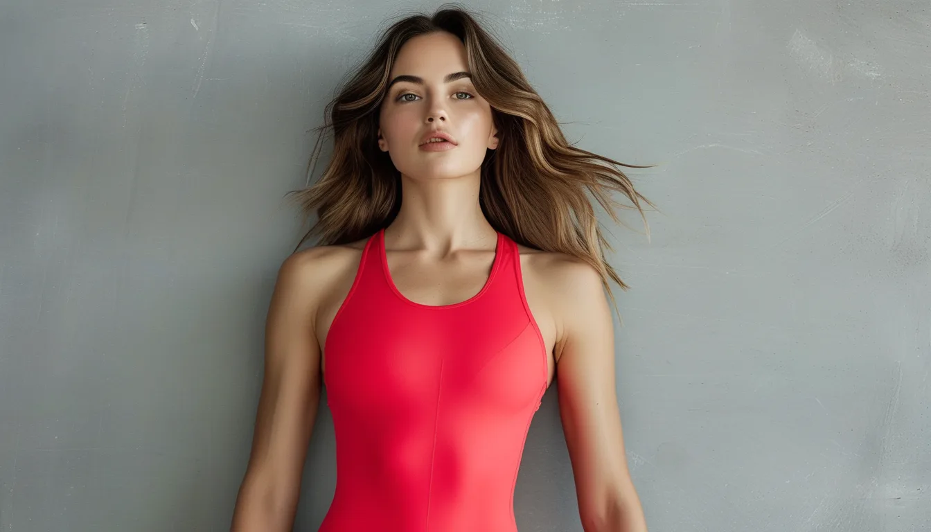
Quick Answer: Red visually reads as two to three times its actual area because the eye is pulled toward it before anything else in the frame. That gives you a simple proportion rule: red at up to one third of the visible outfit works as an accent that flatters without effort, red at two thirds or more works as a deliberate monochrome statement, and the awkward zone is the half-and-half middle, which reads unresolved. Decide which of the two working modes you want, then place the red where you want eyes to go.
This is the piece of styling math that makes a single red purchase earn its keep across a whole wardrobe.
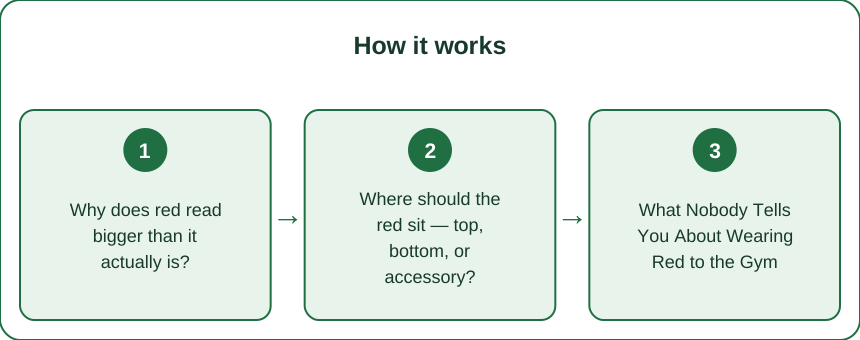
Why does red read bigger than it actually is?
Because your visual system treats it as a priority signal.
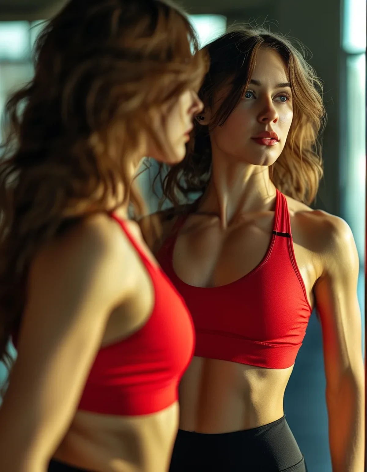
Red sits at the long end of the visible spectrum and carries more attention weight than any other everyday color. Eyes go to it first, linger on it longer, and remember it afterward — which is why a red detail the size of a phone can define how an entire outfit is described. Someone who saw you in black leggings and a red sports bra will say you wore red.
Warm colors also advance: they appear slightly closer and slightly larger than cool colors occupying the same area. A red panel sits forward out of an outfit while a navy panel of identical size settles back into it.
Put those two effects together and the arithmetic changes. A red piece contributes far more visual mass than its square inches, so an outfit that is one-third red by area is already half red by impression. An outfit that is half red by area reads as mostly red — but not committed to it, which is exactly the unresolved middle that feels off without your being able to say why.
This is also why red disappoints people who buy it timidly. A thin red stripe or a small red logo gets swallowed; a red piece needs enough area to register as intentional. The rule is not that less red is safer. It is that red wants to be clearly an accent or clearly the theme, and the sizes in between are where outfits wobble.
Where should the red sit — top, bottom, or accessory?
Each placement does a different job, and knowing the jobs is the whole skill.
Red on top pulls eyes upward. A red sports bra or tank keeps attention in the upper third of the frame, near your face, which is why red tops photograph so well and why they flatter broadly. If you want one red piece that always works, this is it.
Red on the bottom amplifies movement. Legs move more than torsos, and red exaggerates motion the way a flag does. Red leggings in a spin or dance class read vivid and energetic; the same leggings in a quiet yoga room can feel louder than you intended. Bottom-half red is wonderful — it just turns the volume up on whatever your lower body is doing, so match it to the activity.
Red as an accessory is the lowest commitment with the highest style credit. A red cap, red shoes, or a red bag against an otherwise neutral outfit signals confidence without asking you to wear a signal color against your skin. It is also the cheapest way to test whether you enjoy wearing red at all.
One placement note that saves regret: red directly beside your face competes with the natural flush of a hard workout. Mid-effort, faces go pink, and a red collar or strap sitting right at the jawline doubles down on it. If you flush strongly, red on the bottom half or as an accessory will always feel easier than red at the neckline — or pick a deeper cherry tone up top, which contrasts with flush instead of matching it.
What Nobody Tells You About Wearing Red to the Gym
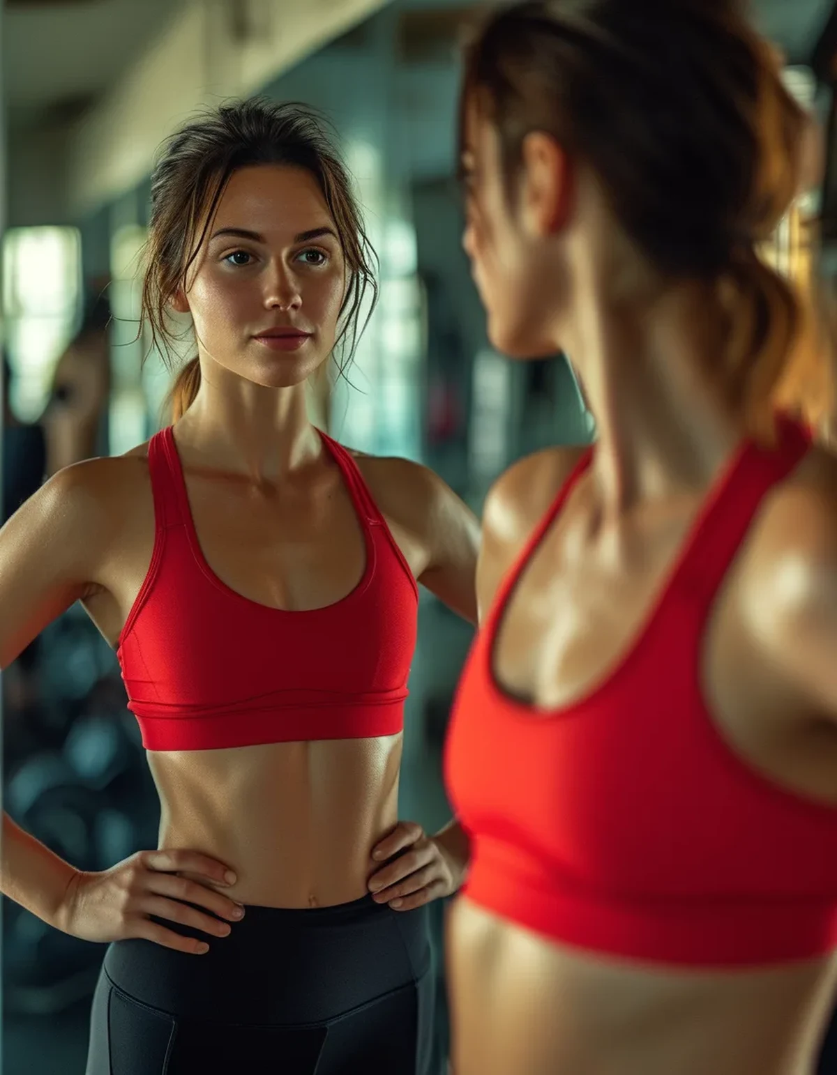
You become easier to correct. Instructors track the vivid person in the room without meaning to — visibility is visibility. If you like form feedback in classes, red is quietly working for you. If you prefer to disappear into the back row, that is a real reason to keep red for solo sessions.
Sweat shows more on mid-reds than dark ones. Sweat darkens fabric, and the contrast between wet and dry is largest in the middle of the red range — a true scarlet shows patches that a deep cherry or a near-black wine barely registers. If visible sweat bothers you, buy your red dark.
Red plus charcoal beats red plus black. Black against red is the highest-contrast pairing in the wardrobe, and it can read a little uniform-like. Charcoal, graphite, and deep grey soften the boundary while keeping all the drama. Bone and cream do the same in the warm direction.
Matching two reds from different brands is nearly impossible. Dye lots differ even within one brand across seasons. Two almost-matching reds look like an accident; the fix is to stop trying — pair your red piece with neutrals, or mismatch on purpose with a clearly different depth, like scarlet with wine.
Red earns compliments out of proportion to effort. It is the color strangers comment on. If a training block has gone flat and sessions need a spark, the psychology is real enough: people stand differently in a color that announces them.
How do you build outfits around one red piece?
With three ratio recipes that cover almost every situation.
The accent formula — red at one third or less. One red piece, everything else quiet: a red sports bra under a charcoal tank with black high-waisted leggings, or a red cap and red laces against head-to-toe greige. The red does all the talking, the neutrals give it a stage, and nothing competes. This is the default, and it survives every setting from studio to street.
The statement formula — red at two thirds or more. The full red matching set, worn with deliberately invisible everything else: neutral shoes, no busy accessories, hair simple. Head-to-toe red works precisely because it is unambiguous — commit and it reads powerful; hedge with a loud second color and it tips costume.
The bridge formula — red plus its neighbors. For late summer sliding into fall, red pairs beautifully with what the season is already doing: rust, terracotta, chocolate, and warm taupe sit next to red on the wheel and make it look planned rather than loud. A red bra top under a rust zip-up with brown-black yoga pants is an autumn outfit that still carries summer energy.
What to avoid is simpler: the fifty-fifty split, red against a second saturated brights block (red and cobalt both shouting), and tiny timid red details that read accidental.
Buy order, if you own no red yet: accessory first to find your dose, top second because it flatters near the face, full set last — and only once you know you reach for the color.
FAQ: Red Activewear Questions, Answered
Which red suits my skin tone?
There is a red for everyone; the variable is temperature. Blue-based reds — cherry, raspberry, wine — flatter cool undertones, while orange-leaning reds — scarlet, tomato, poppy — flatter warm ones. If you are unsure, the deeper the red, the more universally it behaves.
Can I really wear red head to toe?
Yes, with two conditions: keep the reds identical by buying them as a set from one line, and keep everything else neutral and quiet. Monochrome red fails only when a second color fights it or the reds almost-but-do-not match.
What are the best neutrals to pair with red?
Charcoal, graphite, bone, cream, warm taupe, and denim-adjacent blues. Black works but is the hardest version of the contrast; grey does the same job with less severity.
Is red workable for office athleisure?
At accent dose, absolutely — a red top under a neutral overshirt, or red accessories against greys. The full red set reads gym-first, so save the statement formula for training days and weekends.
TL;DR:
- Red reads two to three times its actual area, so one-third red by area already dominates an outfit’s impression.
- Work in two modes: accent (one third or less, neutrals around it) or statement (two thirds plus, everything else invisible) — and skip the unresolved middle.
- Placement is a tool: red on top flatters near the face, red on the bottom amplifies movement, red accessories give commitment-free confidence.
- Pair red with charcoal, bone, or autumn neighbors like rust and chocolate; never with an almost-matching second red.
Take the one red piece you own and run the accent formula tomorrow — red plus two quiet neutrals. That single ratio is most of what there is to know.
See It in Motion
Seen here: High Waist Yoga Leggings with Inner Pocket — shop it on bubblelime.com
Keep Reading
This article is for general informational and styling purposes only. Fit, sizing, and product availability may vary.