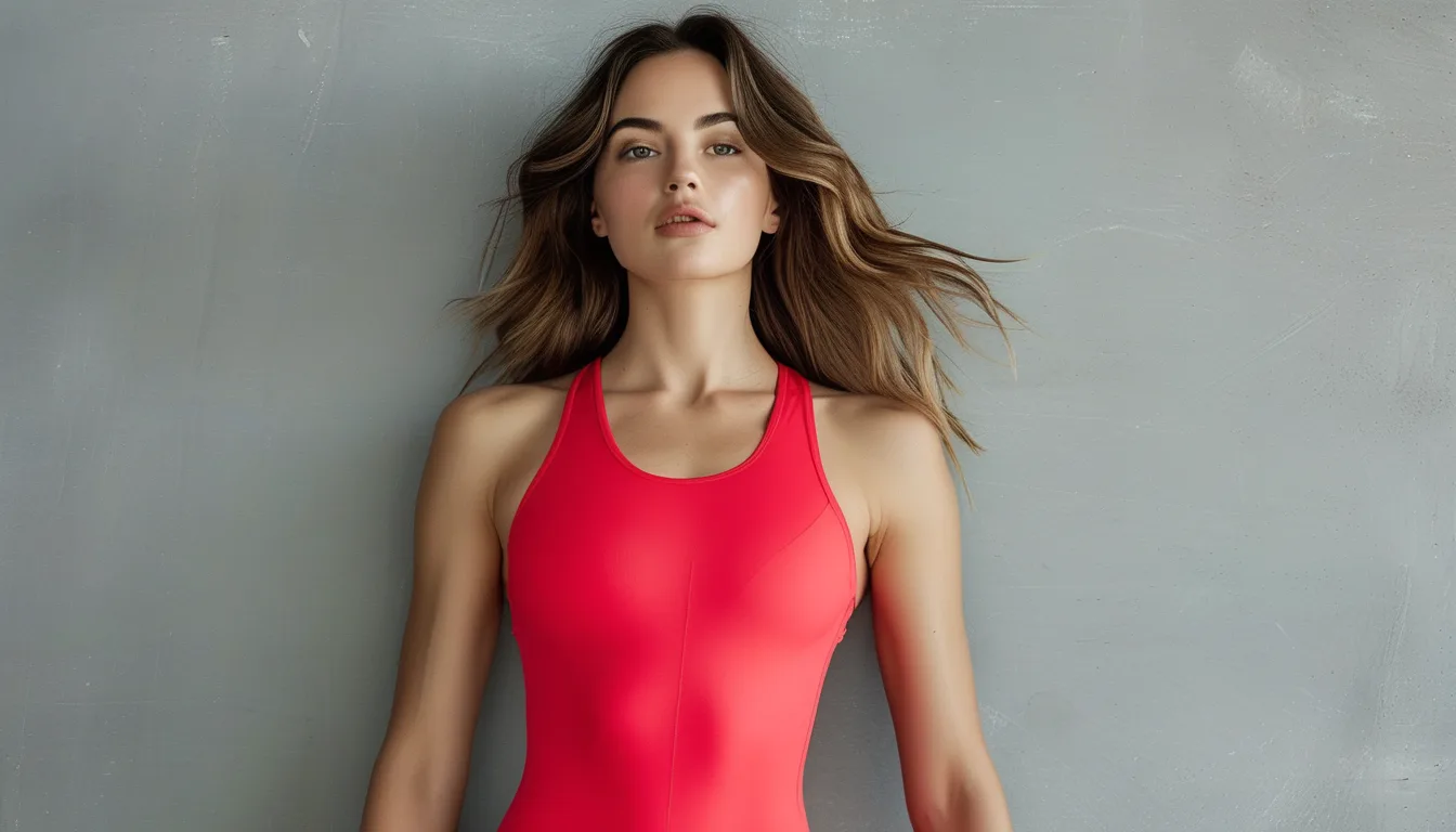
Not All Reds Work on You — How to Pick Warm vs Cool Red
Quick Answer: Red splits into warm reds (tomato, coral-red, brick, rust) with a yellow-orange base, and cool reds (cherry, crimson, berry-red, true red) with a blue base. Warm skin undertones — where veins look green and gold jewelry flatters — generally read best in warm reds. Cool undertones — blue-looking veins, silver jewelry flatters — read best in cool reds. The fastest test is holding two reds under natural daylight and looking at your under-eye area: the wrong red deepens shadows, the right one lifts them.

How do you find your undertone in two minutes?
Three checks, done in natural daylight by a window. Indoor bulbs distort this badly, so the light source is not a detail you can skip.
The vein check. Look at the inside of your wrist. Veins reading green suggest a warm undertone; blue or purple suggests cool; a mix suggests neutral, which is common and gives you more freedom.
The jewelry check. Hold gold against your skin, then silver. Whichever makes your skin look brighter rather than making the metal look brighter is your direction. Gold flatters warm; silver flatters cool.
The white paper check. Hold a sheet of plain white paper next to your bare face. Skin that looks slightly yellow or golden against it is warm; slightly pink or blue is cool.
Undertone is separate from how light or deep your skin is. Two people at very different depths can share the same undertone, and the red that works will be the same family for both.
If all three tests give you different answers, you are likely neutral, and both red families will work — in which case pick by what the rest of your wardrobe leans toward.
What separates a warm red from a cool red?
The base pigment. A warm red has yellow or orange in it. A cool red has blue.
Warm reds: tomato, poppy, coral-red, brick, rust, terracotta, scarlet. These sit naturally alongside camel, olive, cream, gold, and warm browns — which is why they integrate so easily into an earth-tone wardrobe.
Cool reds: cherry, crimson, true red, berry, wine, raspberry. These sit alongside charcoal, navy, pure white, grey, and silver hardware.
A quick way to identify one you are looking at: imagine it next to pure orange. If it looks harmonious, it is warm. If it looks off, it is cool.
Another: hold it next to true black. Cool reds look crisp against black. Warm reds can look slightly muddy or brownish against it, and better against charcoal or brown.
One complication worth knowing: fabric finish shifts the reading. A matte fabric reads slightly deeper and cooler than a shiny one in the same dye. A shiny warm red can read almost orange under gym lighting, while the same color matte reads as a straightforward red.
And screens lie. Red is one of the least accurately reproduced colors online, and the difference between a coral-red and a true red is exactly the difference a screen loses.

How much red should be in an outfit?
One piece, in most cases. Red is the highest-attention color in the visible spectrum for human vision, and it does not need volume to have an effect.
The practical approach: a red sports bra under a neutral top, a red legging with a neutral bra, or red shoes with an all-neutral outfit. Any one of these gives you the full effect.
Red on the top half draws the eye upward toward the face, which is generally the more flattering placement and the reason a red bra or top is the most common choice.
Red on the bottom half is bolder and requires the top to be genuinely quiet. It works well with a matched neutral for everything else.
Red accessories — shoes, a headband, a water bottle — give the effect at the lowest commitment, and they let you test whether you actually enjoy wearing red before buying a full piece.
When two red pieces work: when they are the same red. Two slightly different reds together is the combination that reads as a mistake, because the eye compares them directly and notices the mismatch instantly. Two pieces in the exact same dye lot read as a set.
And if you want red without the intensity, rust and brick are warm reds that behave more like neutrals in an outfit, which is why they anchor so many fall palettes.
Myth vs Fact: Wearing Red
Myth: Redheads and people with pink skin cannot wear red. Fact: They cannot wear reds that match their own coloring too closely. A blue-based red against pink-toned skin reads as competition; a warm brick or rust against the same skin usually looks excellent.
Myth: Red makes you look larger. Fact: Bright colors advance visually, but placement matters far more than color. A red piece at the point you want emphasized works exactly the way any color there would.
Myth: Red is not a neutral, so it does not belong in a capsule. Fact: One red accent piece in an otherwise neutral capsule is the highest-leverage single item you can add. It appears in a third of your outfits and changes all of them.
Myth: True red is a universal shade. Fact: True red sits right at the boundary between warm and cool, which makes it the most broadly wearable, but not universal. Some people still read better in a clearly warm or clearly cool version.
Myth: Red fades faster than other colors. Fact: It does fade noticeably, because red dyes are among the least colorfast — especially in the warm, orange-based range. Cold wash and inside-out helps considerably.
FAQ: Red Activewear Questions, Answered
Does red really show sweat more?
Mid-tone reds show wet marks with high contrast, similar to grey. Deep reds like wine and burgundy hide it well. Bright reds sit in between, and a textured fabric helps regardless of shade.
What neutral goes best with a warm red?
Camel, cream, olive, and warm grey. Avoid pure white with warm reds — the cool white makes the red look muddier by comparison. Cream is the better light neutral.
Will red bleed onto other clothes in the wash?
Often, for the first several washes. Wash new red items separately or with darks, in cold water. A color-catcher sheet is worth using for the first few cycles.
Is there a red that works for almost everyone?
A true red with a very slight blue lean is the safest single choice, which is why it appears in so many brand palettes. If you are buying without being able to test, that is the version to pick.
TL;DR:
- Reds split into warm (tomato, brick, rust) and cool (cherry, crimson, berry).
- Find your undertone with the vein, jewelry, and white paper checks — in natural daylight only.
- Warm undertones lean warm red; cool undertones lean cool red; neutral undertones can wear both.
- One red piece per outfit, and if you wear two, make them the exact same red.
- Red dyes fade fast — cold wash, inside out, and separate for the first few cycles.
The difference between a red that lifts your face and one that drains it is a two-minute test at a window. Worth doing once.
Keep Reading
This article is for general informational and styling purposes only. Fit, sizing, and product availability may vary.